All that aroused our senses during Salone 2023
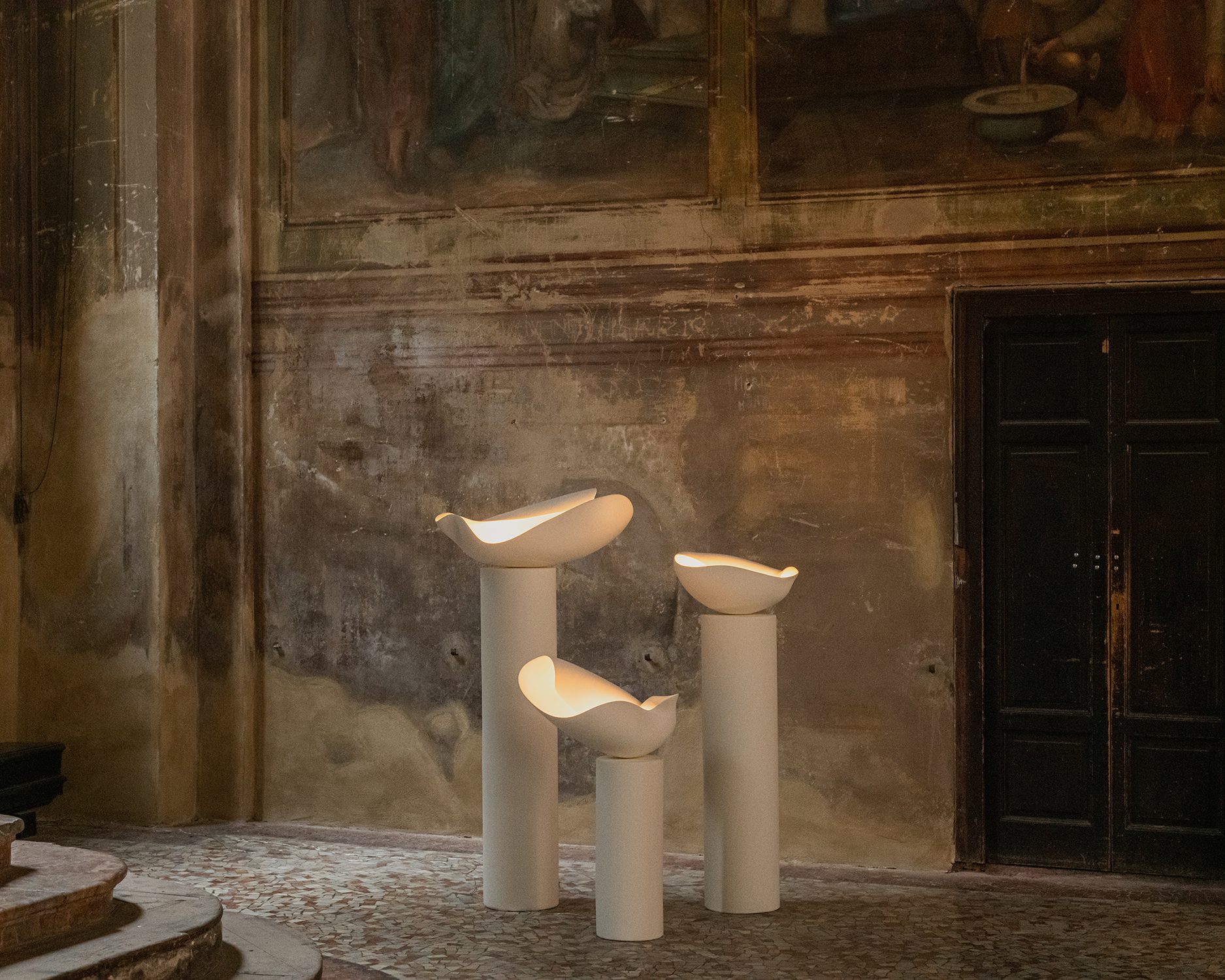
This edition of Fuorisalone has taken place in a range of unexpected but major venues. One of the most incredible ones was the 11th-century church chosen by Galerie Philia to show “Desacralized”, an exhibition to reflect on the idea of how a religious object might become functional.
 GALERIE PHILIA
The twenty five artists involved in this proposal had just one requirement set by themselves: all the pieces should be white. The result was a range of precious and beautiful pieces by Arno Declercq, Lucas Morten, Niclas Wolf, Pietro Franceschini and Rick Owens among others.
 CC-TAPIS SHOWROOM
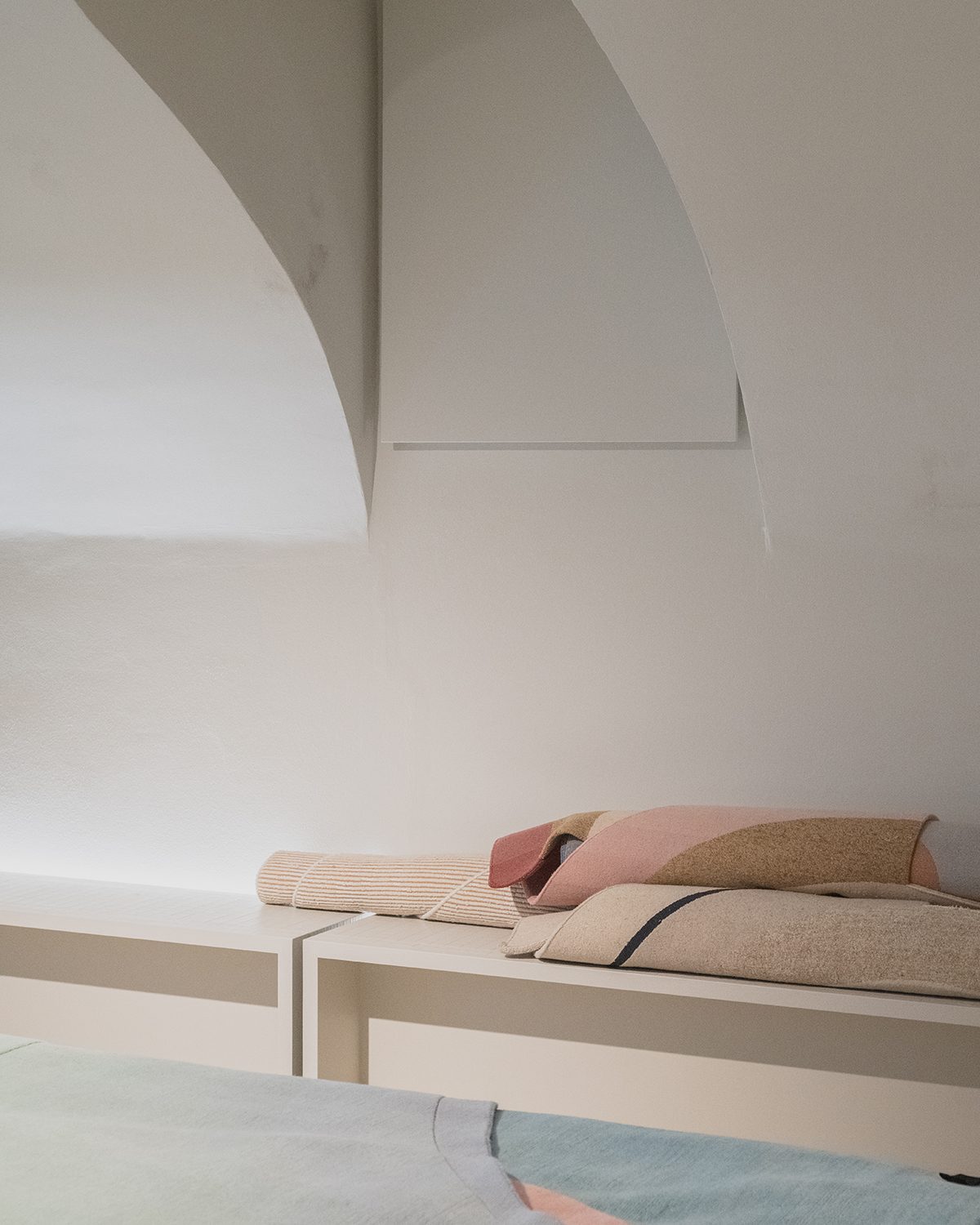 CC-TAPIS SHOWROOM
‘Cascades of Light’, a monumental and sculptural chandelier by Italian design duo Morghen Studio, at the center of the exhibition, was the dominating piece at the space, created as a way to transcend and sublimate the symbolic significance of these utensils throughout the story. Studiopepe created an architectural marble side table inspired by an ancient Italian baptistery whose octagonal shape alludes to the number 8, the symbol of rebirth in many religions and myths.
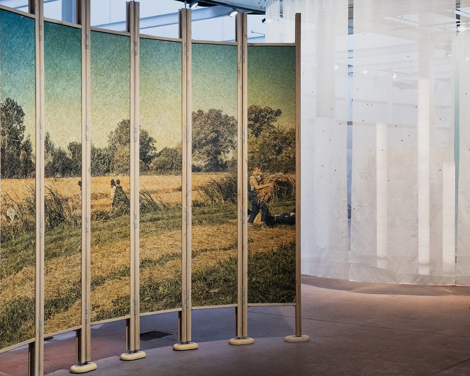 ALCOVA
 Pietro Franceschini showed a curvature coffee table, playing with the concept of materiality and transformation, while Kar Studio showcased a chair inspired by China’s oldest script from the Shang Dynasty. ‘Kielich’, the piece created by Jan Garncarek & Ewelina Makosa (two talented minds from Poland we met thanks to Studio Fenice) was a censer made on the basis of molds, sacred chalices from100 year old wood, created as an interpretation of the human relation towards sacred objects and its change nowadays.
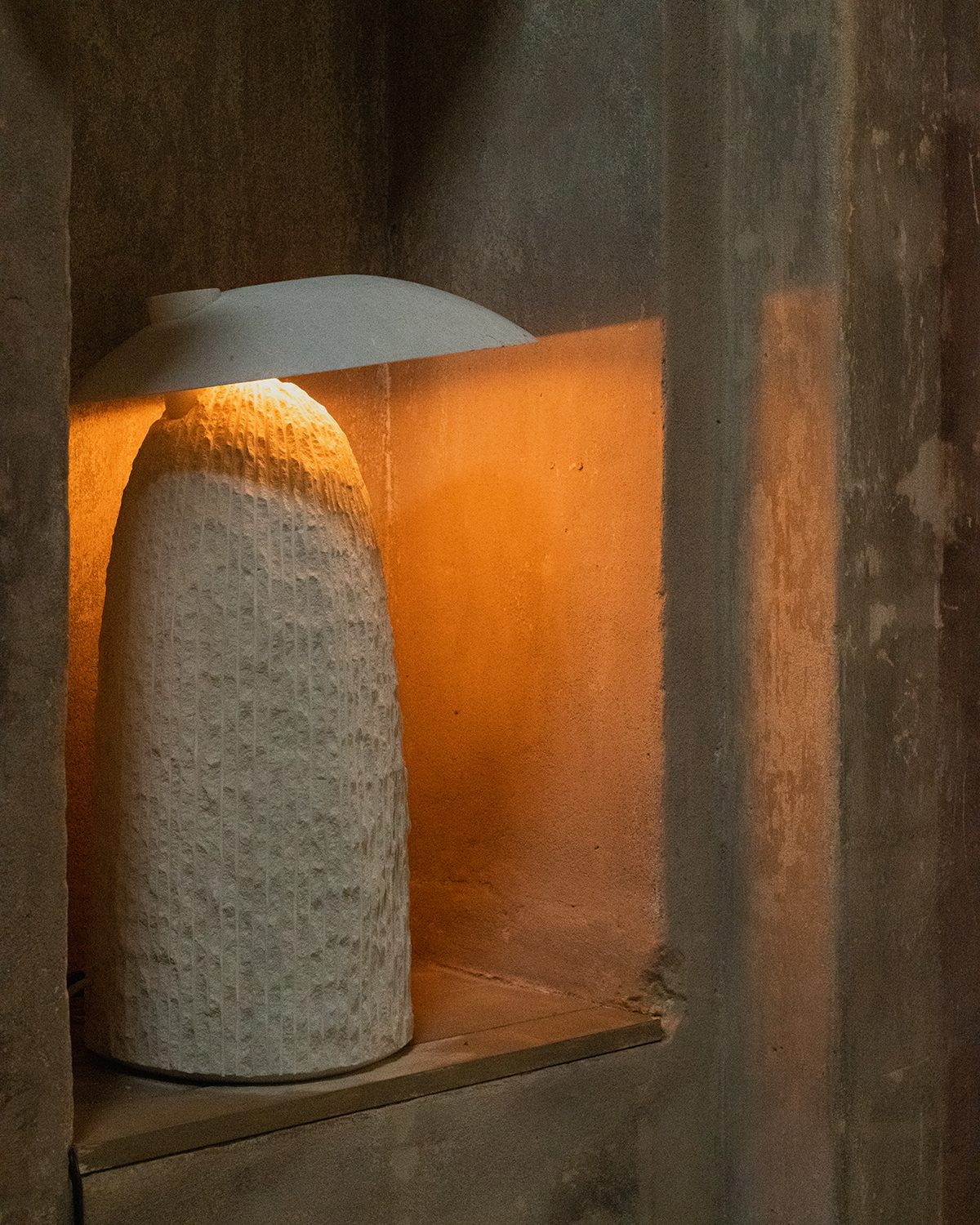 GALERIE PHILIA
 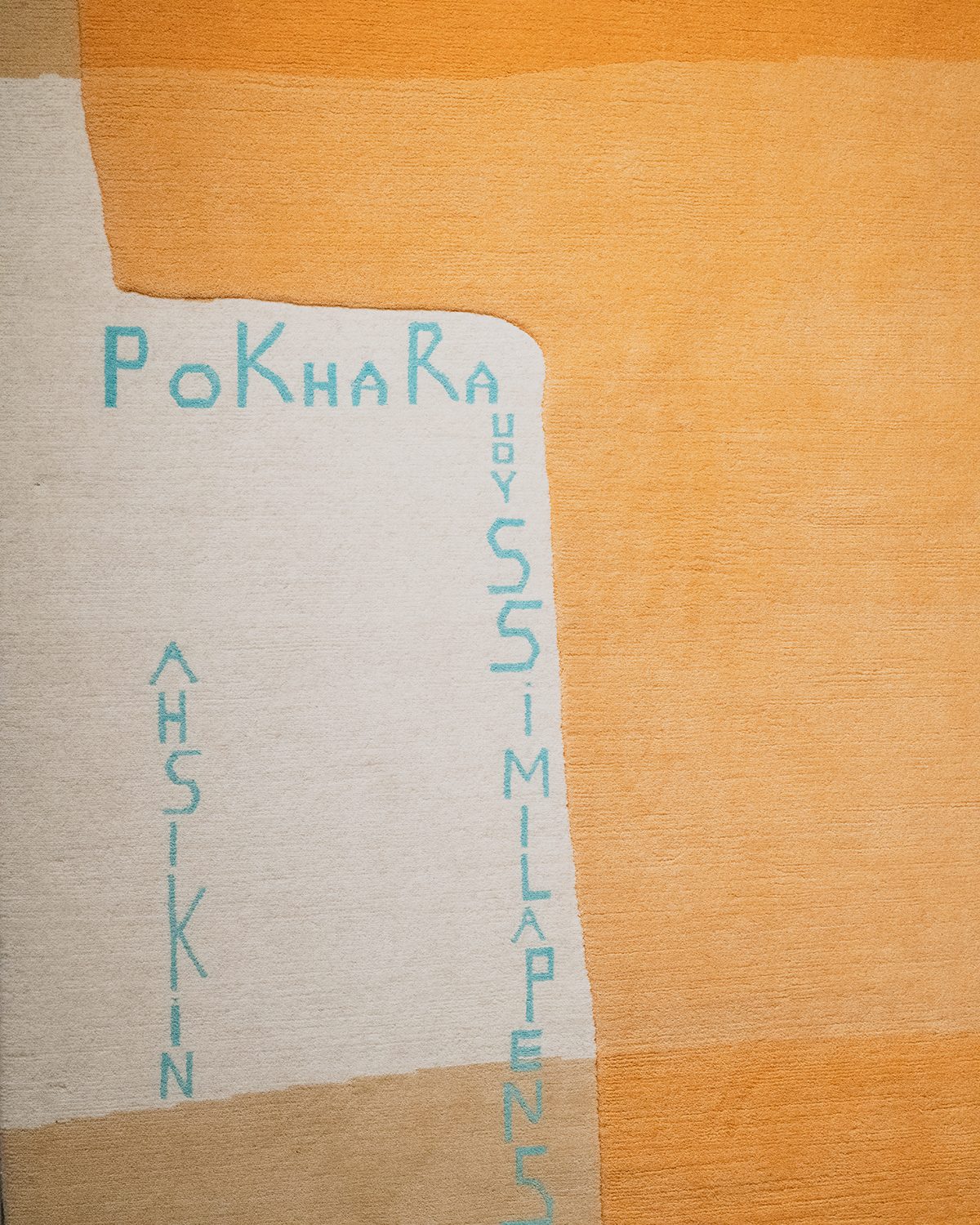 CC-TAPIS
 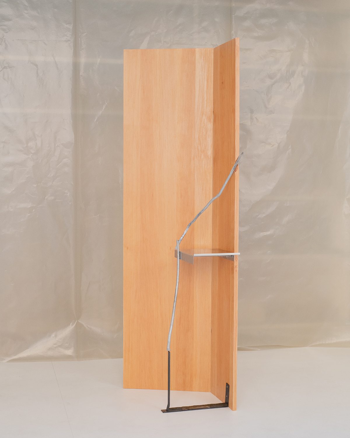 OXILIA GALLERY
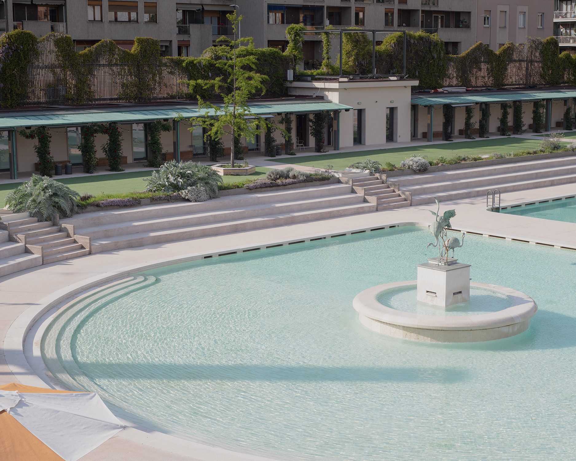
 Gubi recreated a whole universe full of intrigue in a former public pool called Bagni Misteriosi (you can read more about it in this article) and
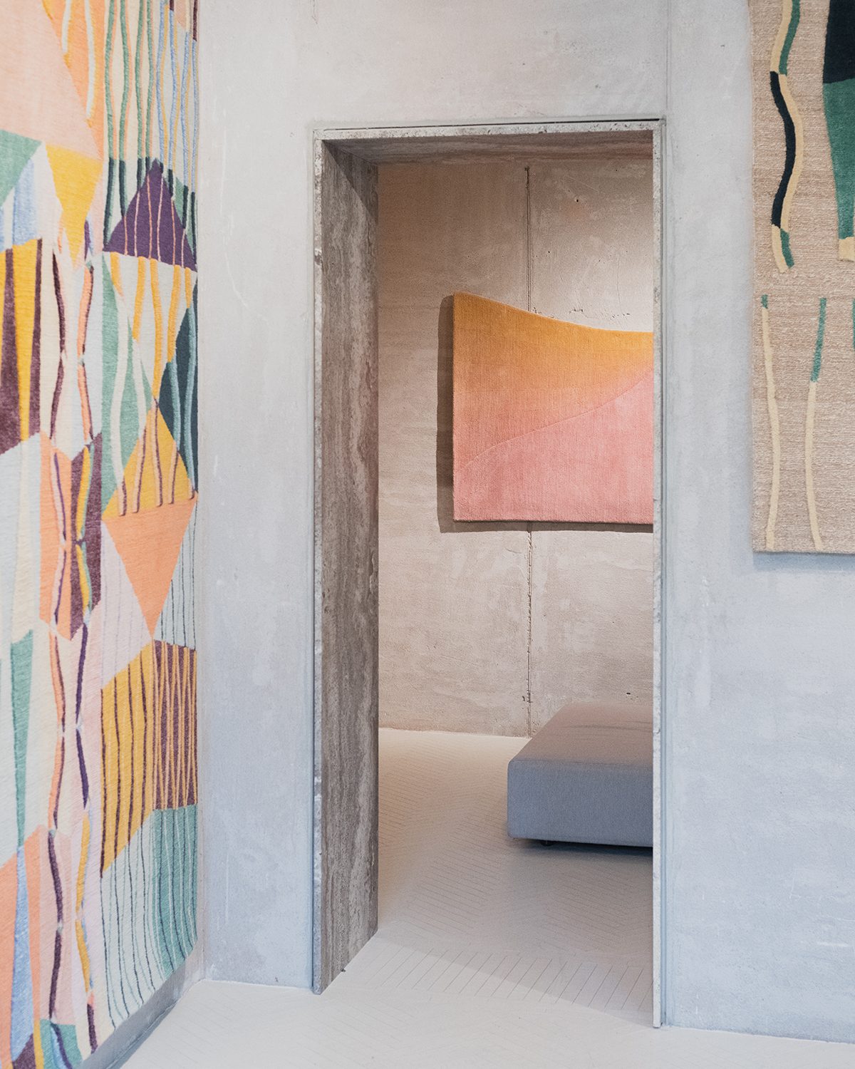
cc-tapis transformed its Milanese showroom into a sort of tapestry museum full of color and a sense of freedom with works by Formafantasma, Objects of Common Interest and Patricia Urquiola among other novelties presented by the Italian brand.
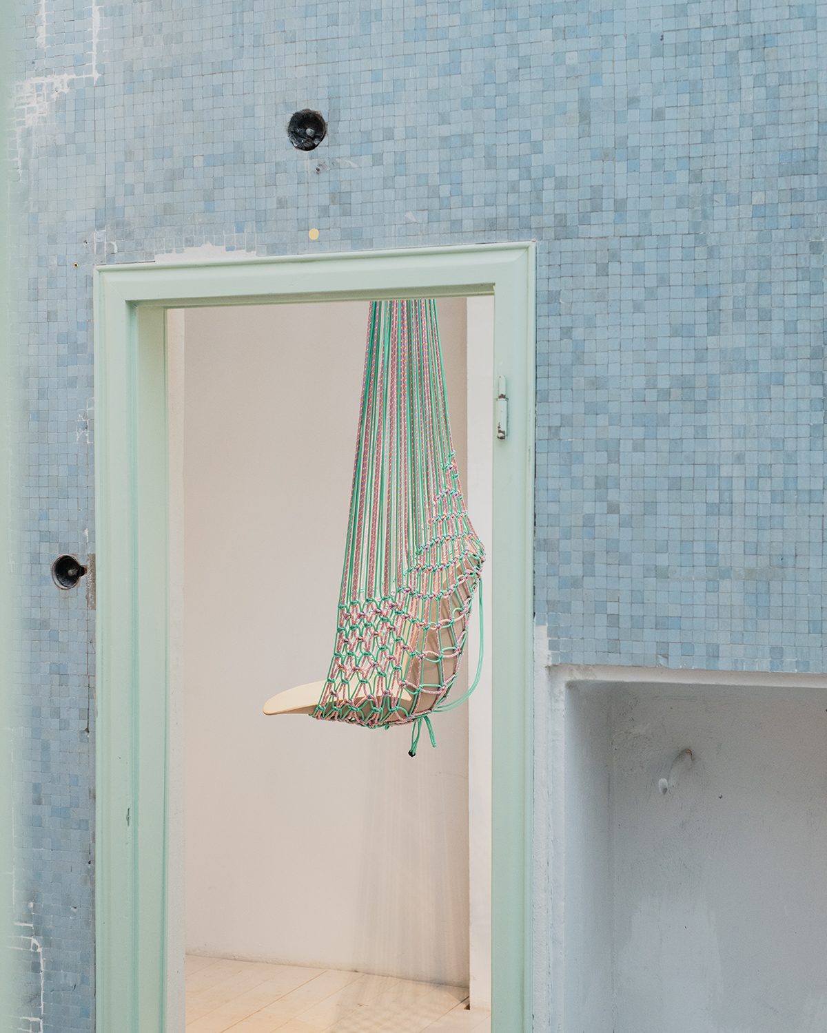 GUBI EXHIBITION
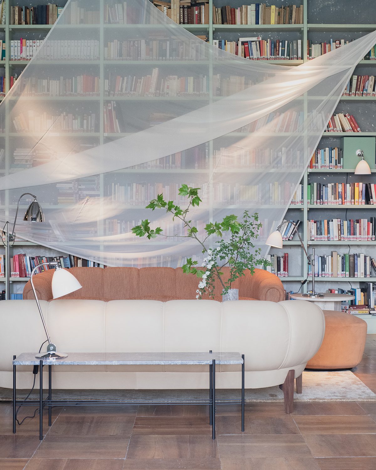 GUBI EXHIBITION
At Vincenzo de Cotiis Gallery we learned that the limits can be exceeded. The bold way in which Vincenzo merged materiality, defying conventions and shapes in a tribute to the arc form, was a breathtaking experience. The artists and installations proposed by galleries such as Oxilia and Nilufar exemplify how design and art are no more than two linked disciplines.
The statement of Poliform was a significant one. Marked by a big black framed door, it questioned our perception ‘Between Nature and Matter’. The fifteenth-century architecture of San Simpliciano cloisters had a conversation with both the volcanic lapilli surface, and the symphony composed by Caterina Barbieri, creating an immersive space to connect with all the senses.
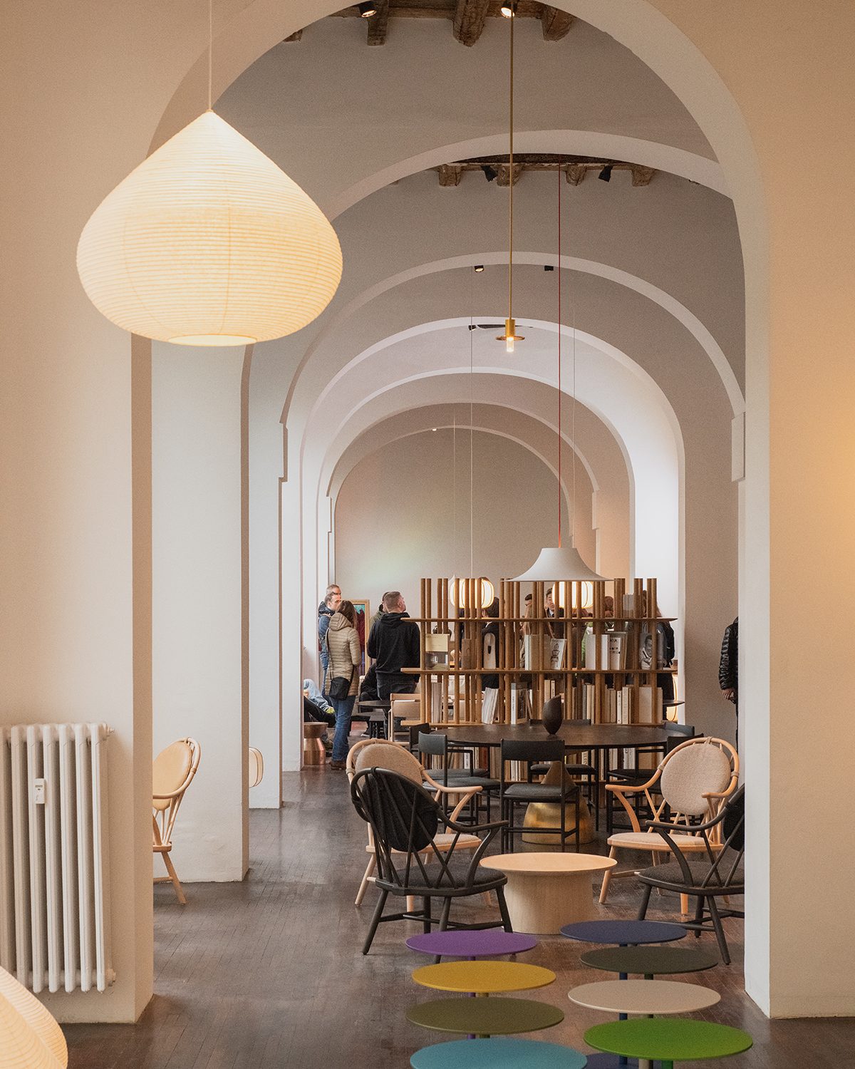 TIME & STYLE SHOWROOM
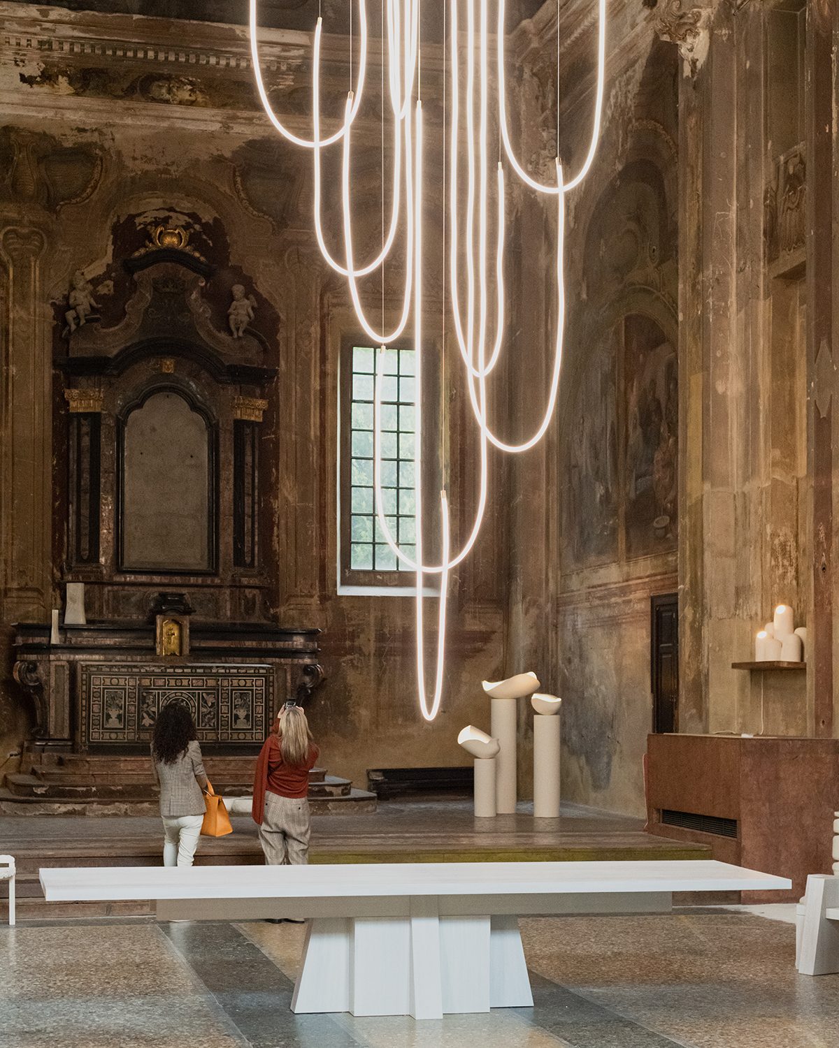 GALERIE PHILIA EXHIBITION
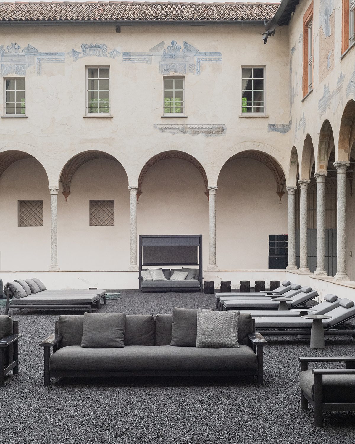 POLIFORM
Time & Style definitely aroused our desire. An inner feeling we cannot describe with words but it is risen at our heart leading us to love the pieces created by them. We liked this Japanese brand before the Salone. Now we love it.
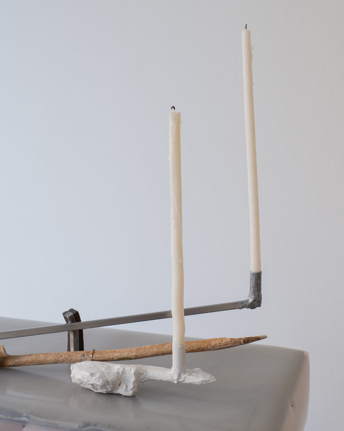 OXILIA GALLERY
 COORDONNÉ AT 'ILLUMINATA' EXHIBITION
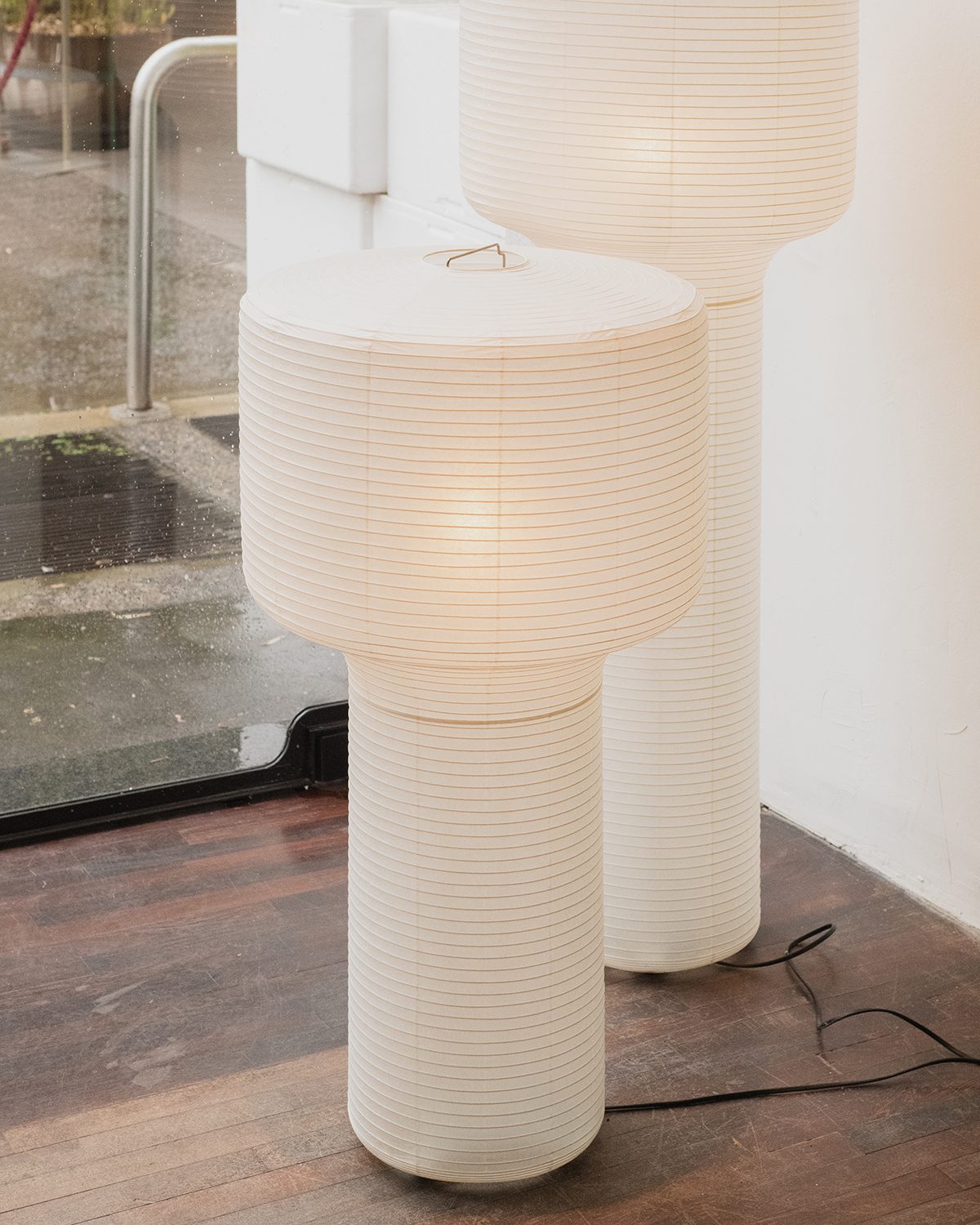 TIME & STYLE SHOWROOM
 At their new Dimorecentrale headquarters and gallery, the Dimorestudio designers Britt Moran and Emiliano Salci presented a set of scenes that combined vintage furniture with their own pieces, each one with a distinct narrative and aesthetic in a truly daring arrangement detailed in this article.
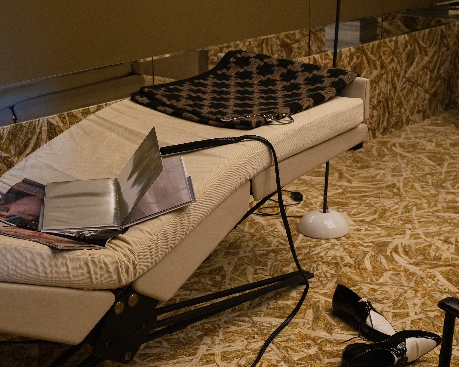
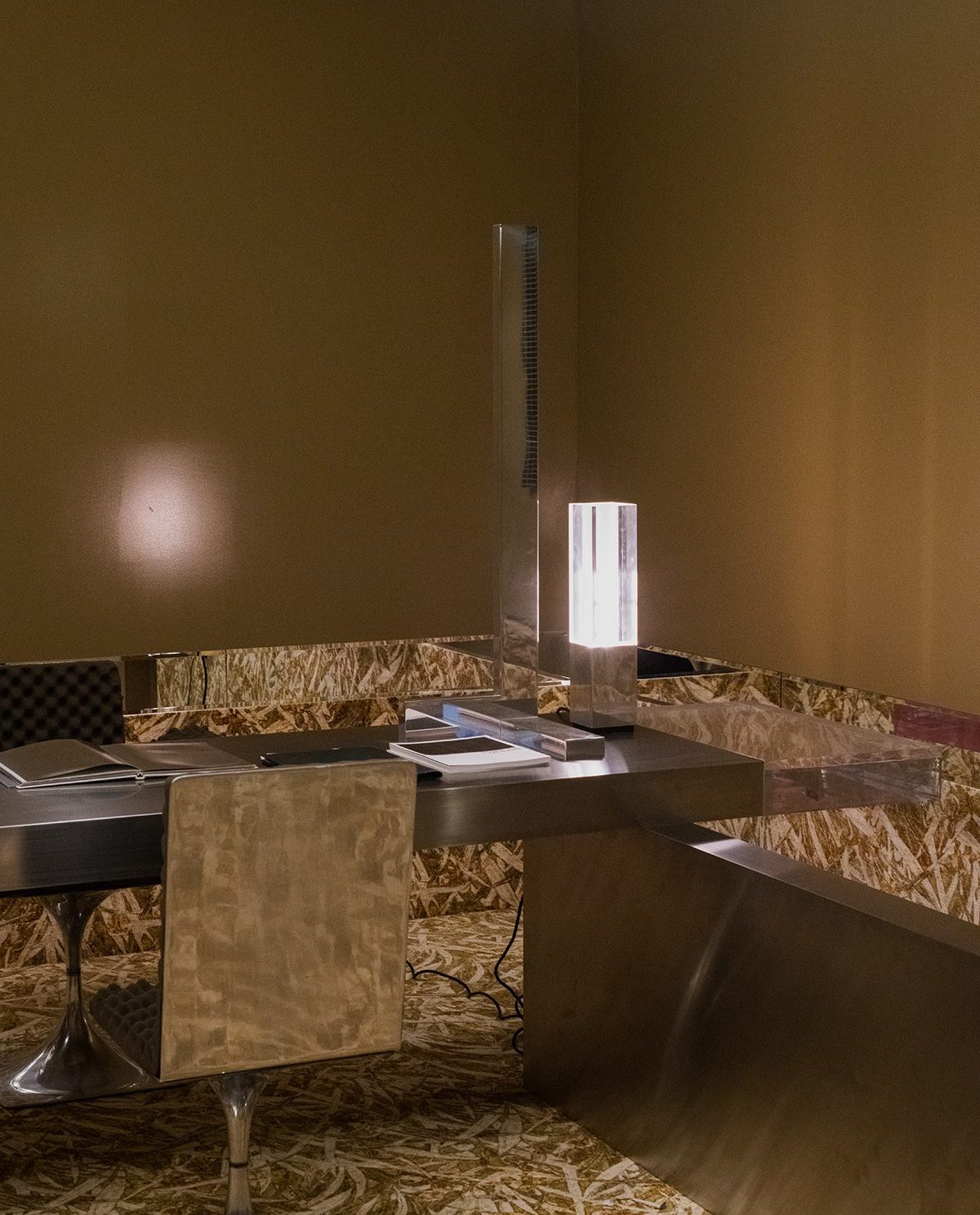 DIMORECENTRALE EXHIBITION
 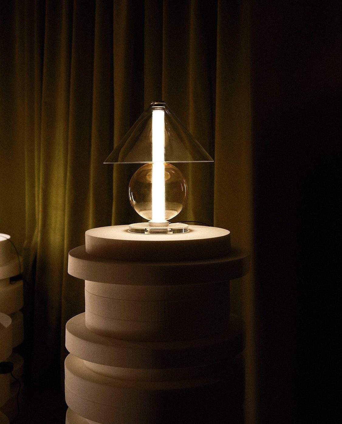 MARSET'S 'UNSEEN ROOMS' EXHIBITION
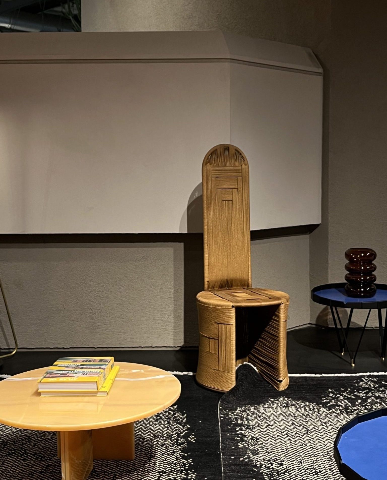 BAXTER
Even being loyal to its traditional principles, Hermès always seems to offer something new to us. It is weird though, because at the same time, we kind of feel at home every time we enter any of the spaces the Parisian brand has all around the world. And that is because there is no other brand like it. Not even with similarities. And that is the charming side of it. We had not seen such a quantity of elegant people trying to enter a party before this edition of Salone at Hermès showroom.
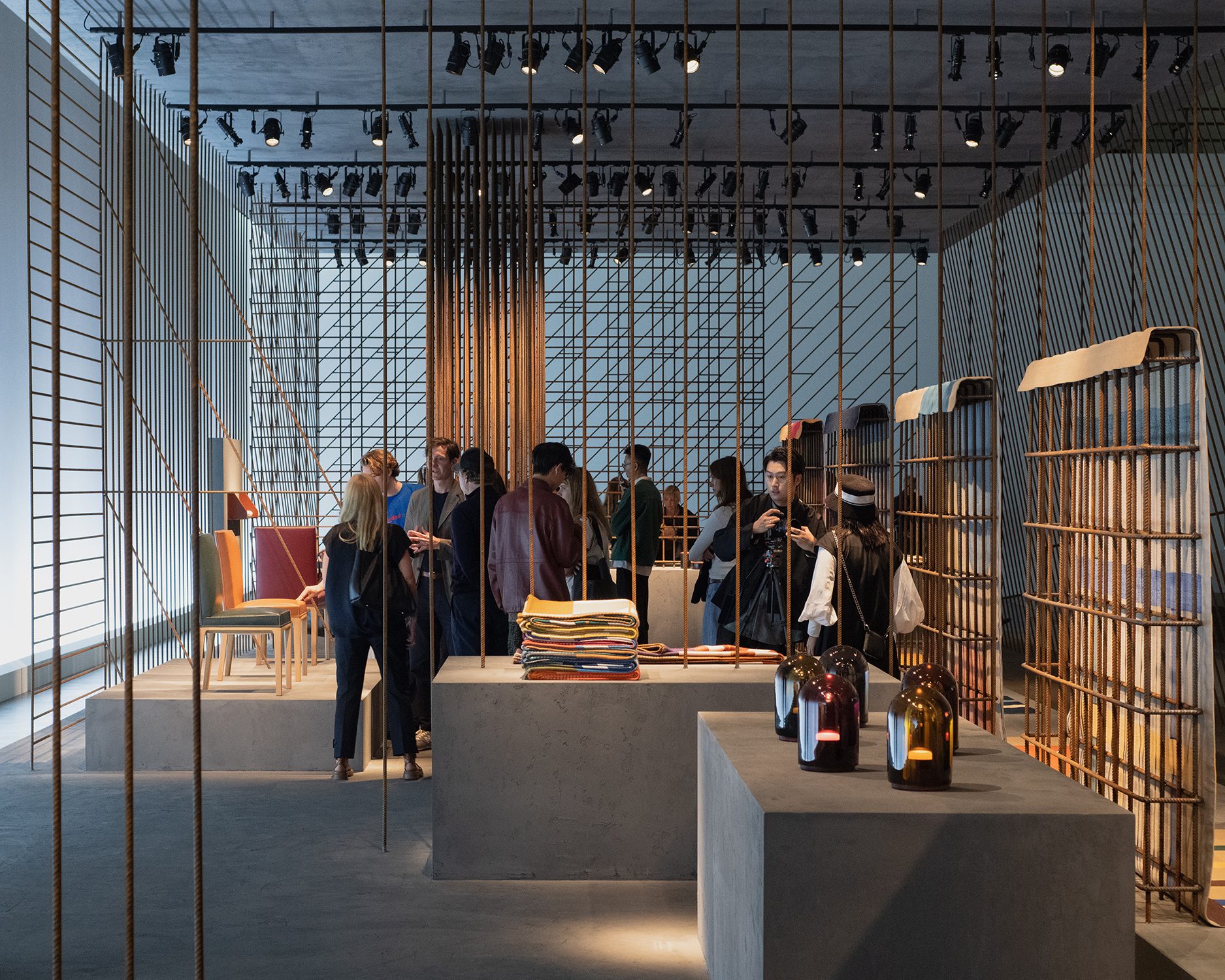 HERMÈS EXHIBITION
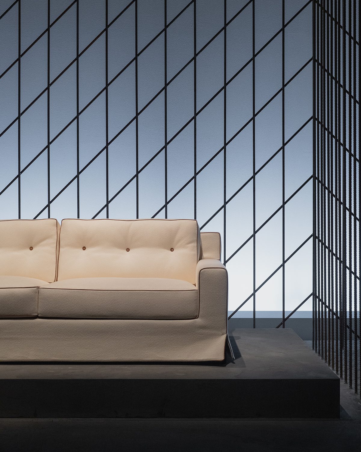 HERMÈS EXHIBITION
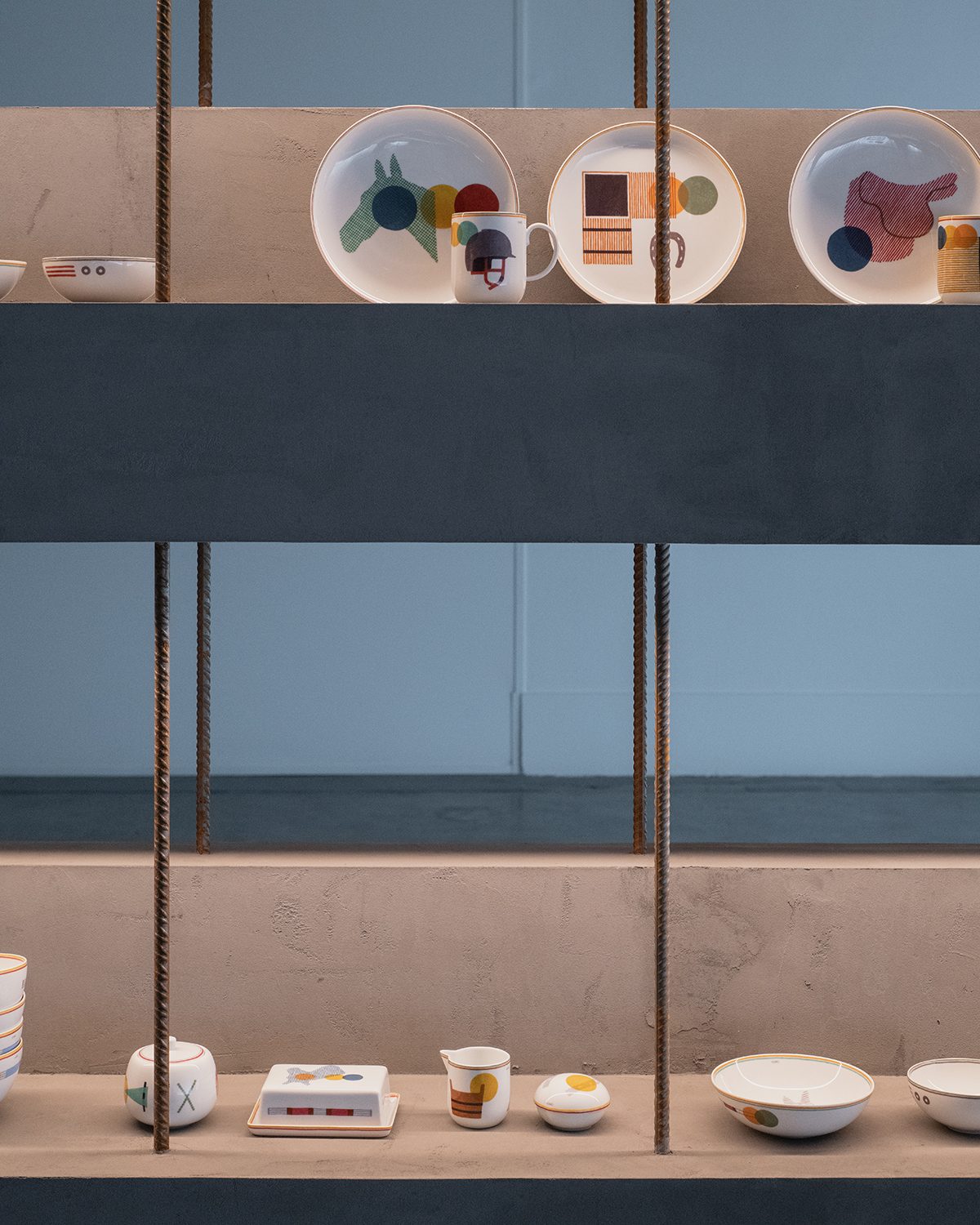 HERMÈS EXHIBITION


