Finding Beauty In The Unadorned Wall
John Pawson
Minimalism is a term that is often misconstrued in this day and age. It has become a sort of catch-all, with various renditions, definitions, and faces. But when witnessed in its honest form, minimalism has the ability to stir up feeling, prompting us to pause and encounter something that is both outside of and deeply within ourselves. Or, as John Pawson describes: “engage in the process of subtraction.”
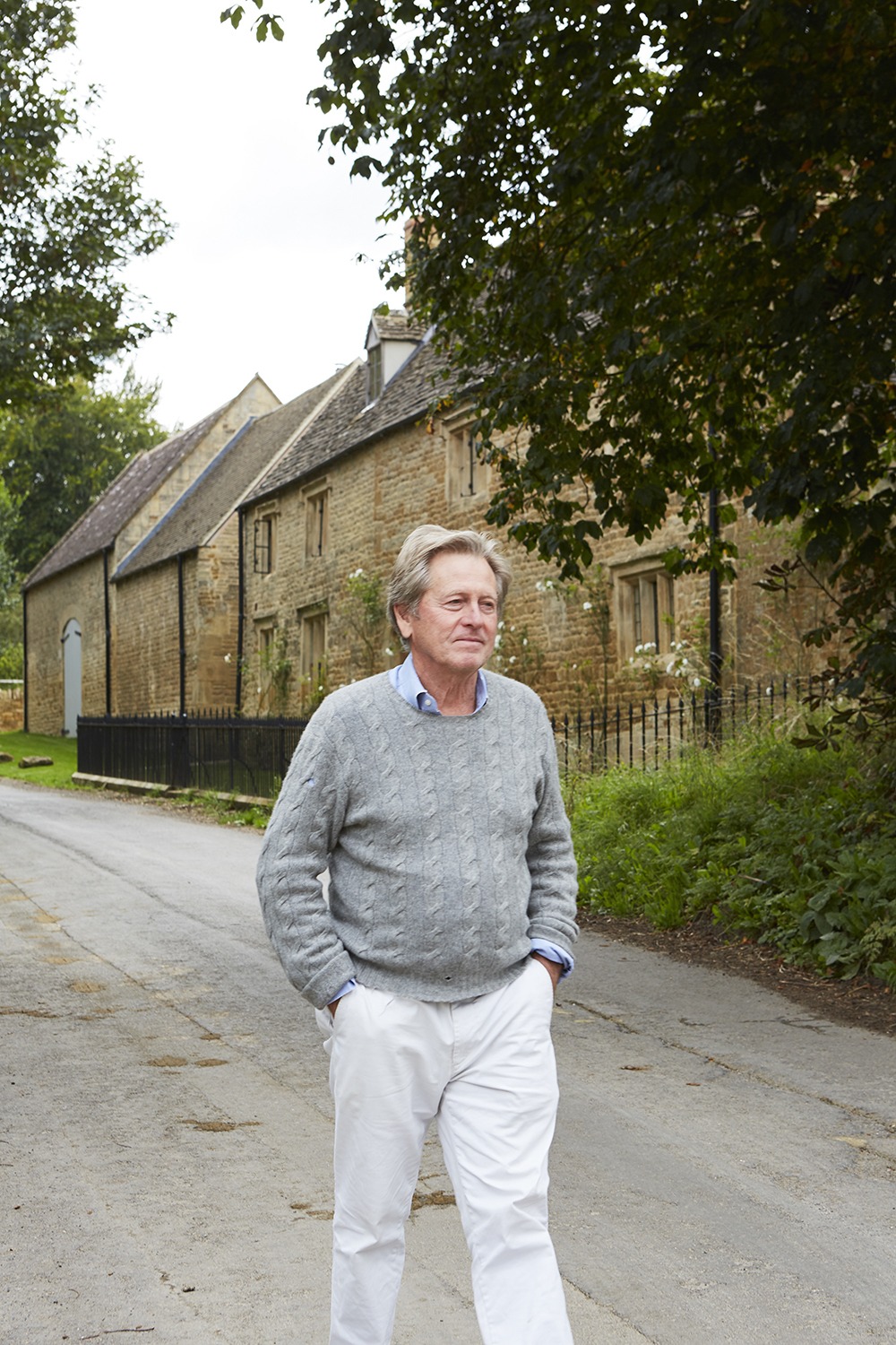
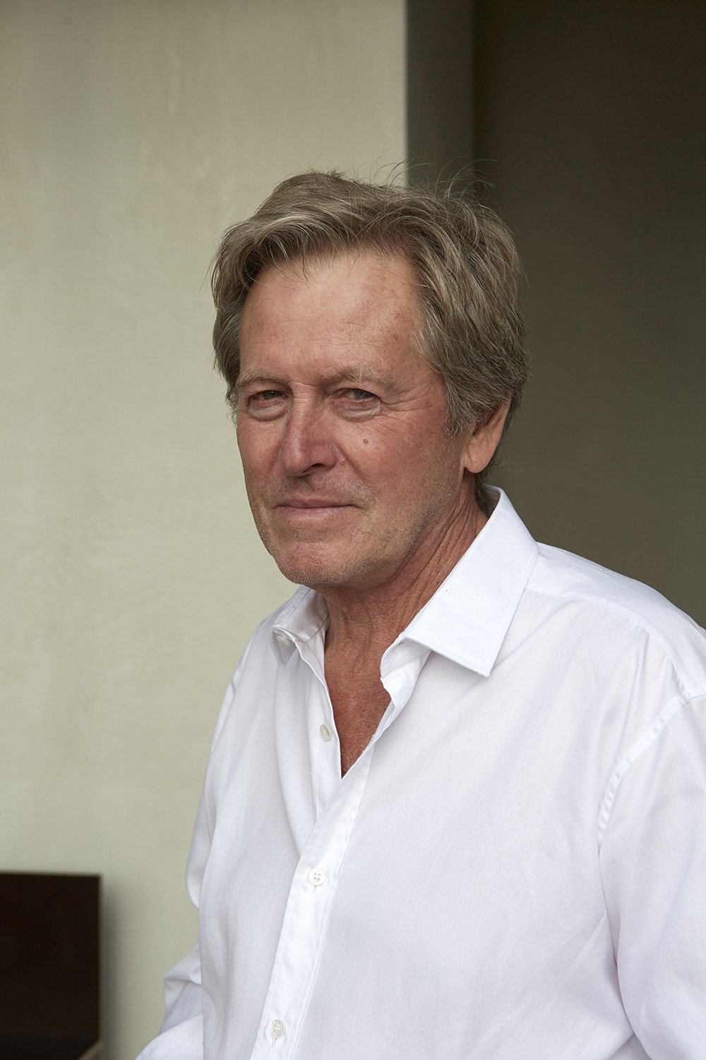
John is an architect who has spent the last four decades making rigorously simple, yet inexplicably emotional spaces. He was one of the first designers to push minimalism to the forefront of the era, and his body of work has spanned an impressive range of scales and typologies. From private houses and sacred commissions to museums, galleries, and bridges—each of his works holds tangible power and purity in the same hand.
Such uncomplicated spaces have always interested him. From the onset of his childhood, John found that unornamented rooms allowed him a sort of clarity and an uninhibited sense of freedom. He would often experiment with what made areas comfortable to be in and make radical alterations to those assigned to him. (He even went so far as to throw out all of the furniture in his bedroom at primary school.)
This instinctual draw toward empty spaces has since given way to an enigmatic architectural style: a signature approach to proportion and light, which accompanies a potent language comprised of windows, doors, and walls. Whether at the scale of a monastery, a house, or a ballet, everything John creates can be traced back to a consistent set of preoccupations with mass, volume, surface, proportion, junction, geometry, repetition, light, and ritual. In this way, even something as modest as a fork can become a vehicle for broader ideas related to how we live and what we value.
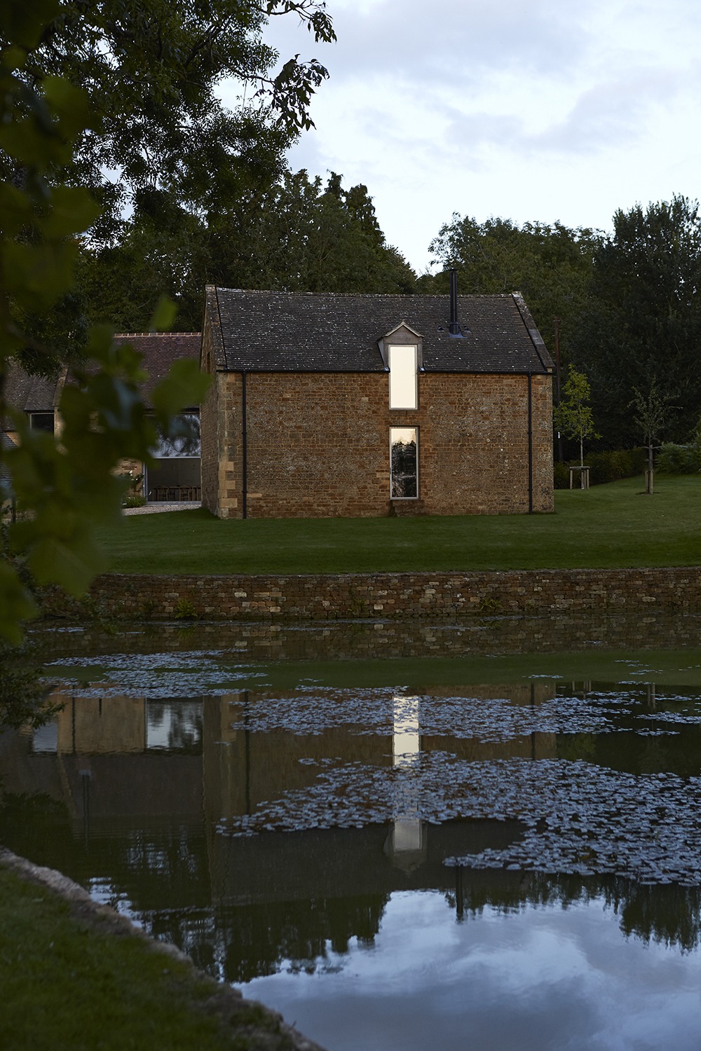
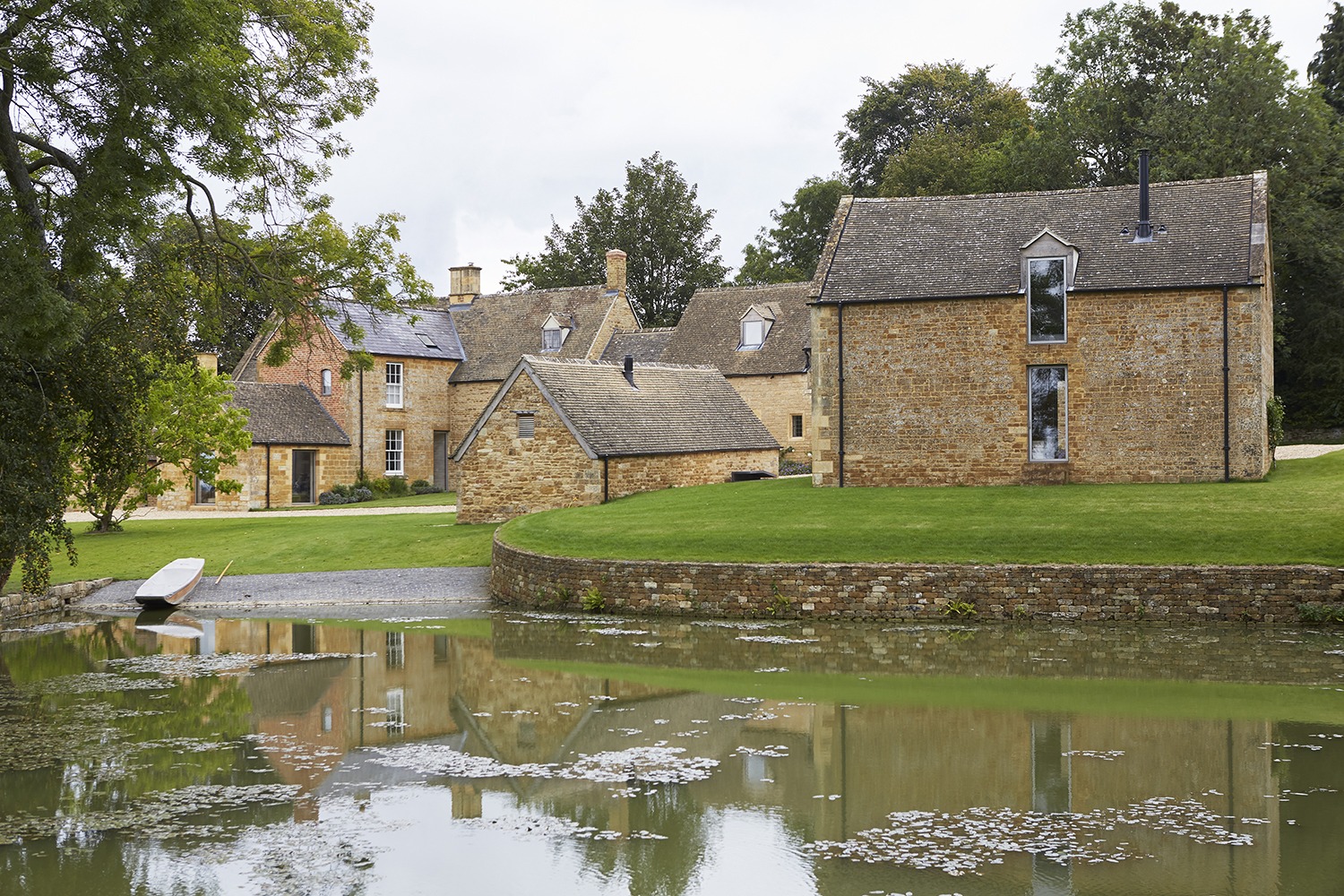
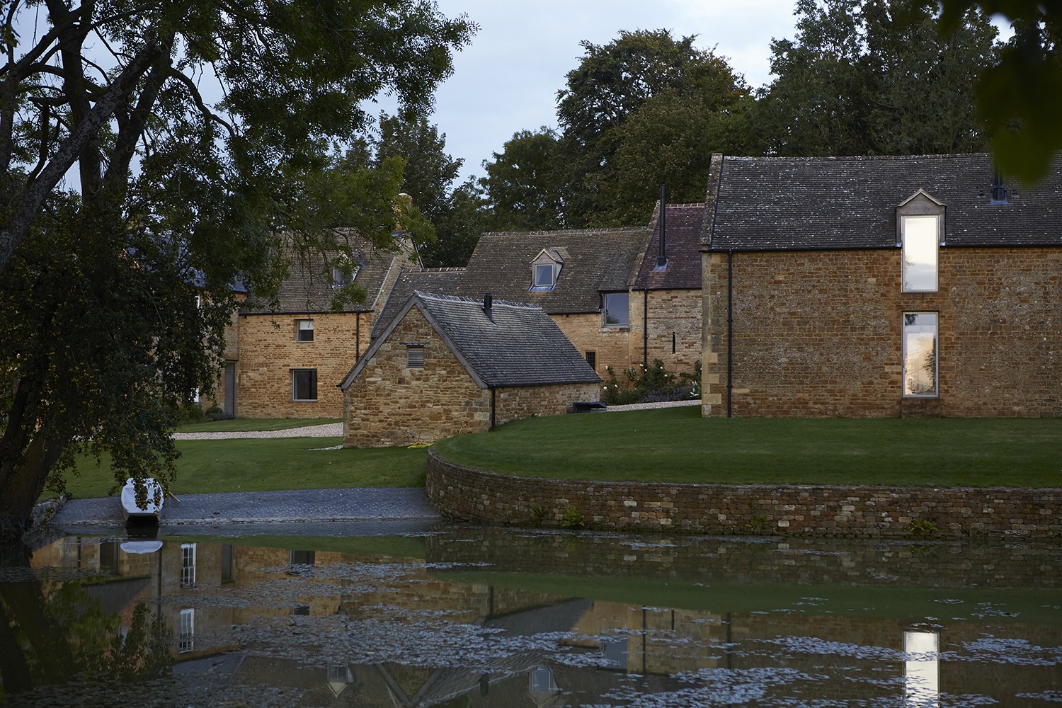
John’s most recent endeavor—his personal home in Gloucestershire, England—is no exception. What started off as a 7,000-square-foot property containing a 17th-century farmhouse, 18th-century stables, and several outbuildings has since transformed into an aesthetically moving environment. In order to learn how his design philosophy came to life in Home Farm, Andrew Trotter and I met with John in his quiet corner of English countryside.
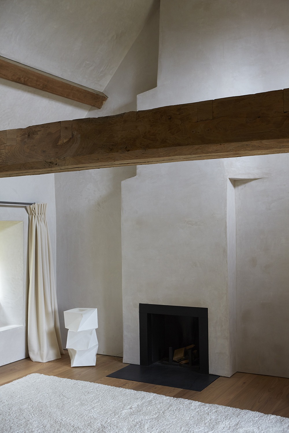
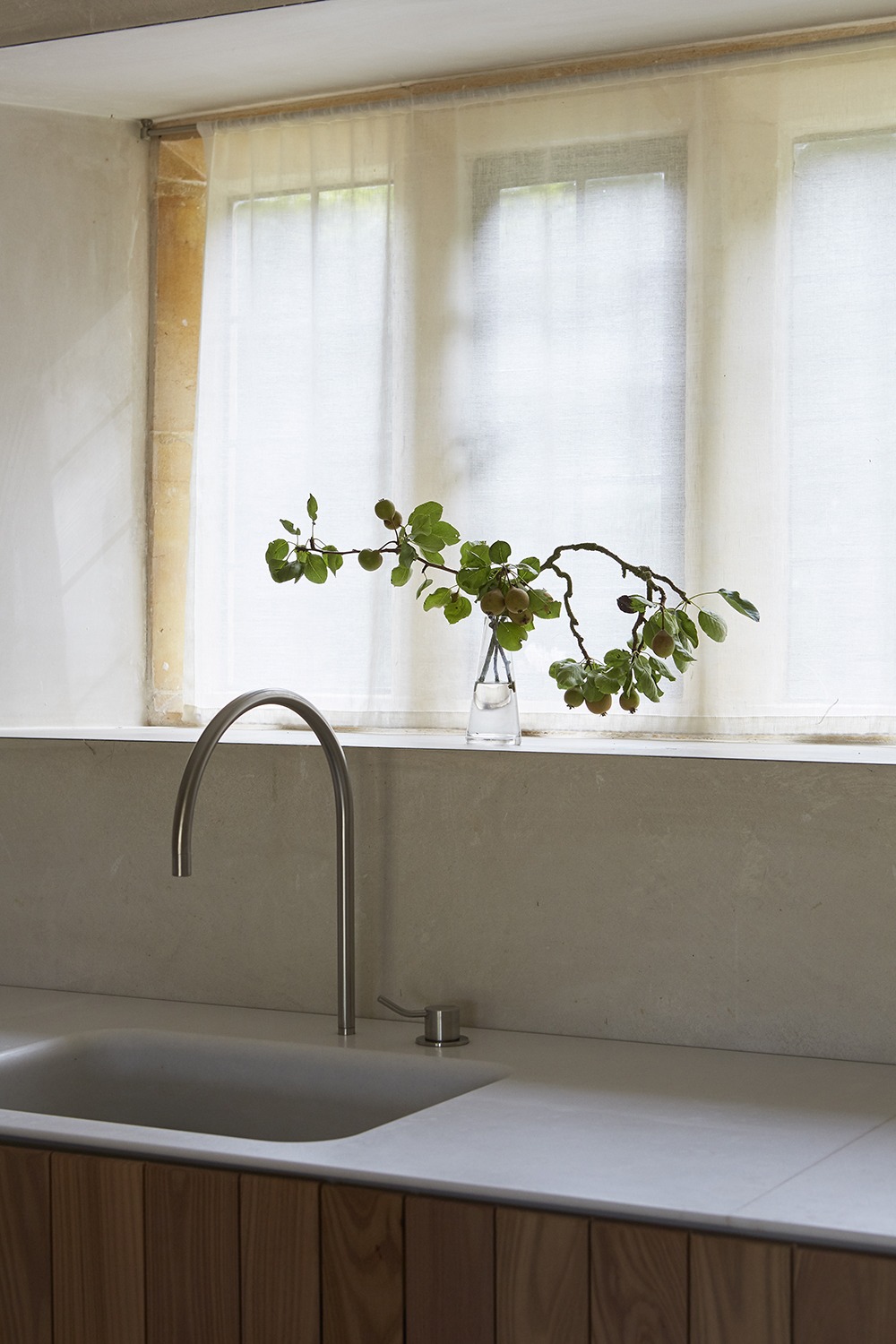
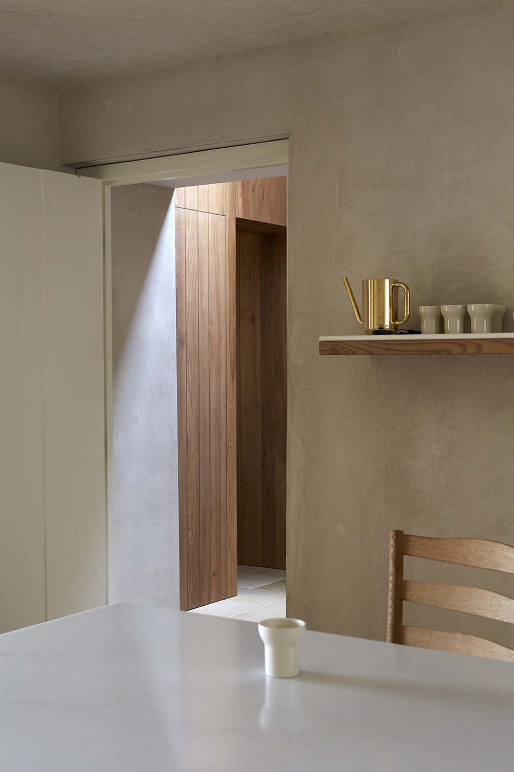
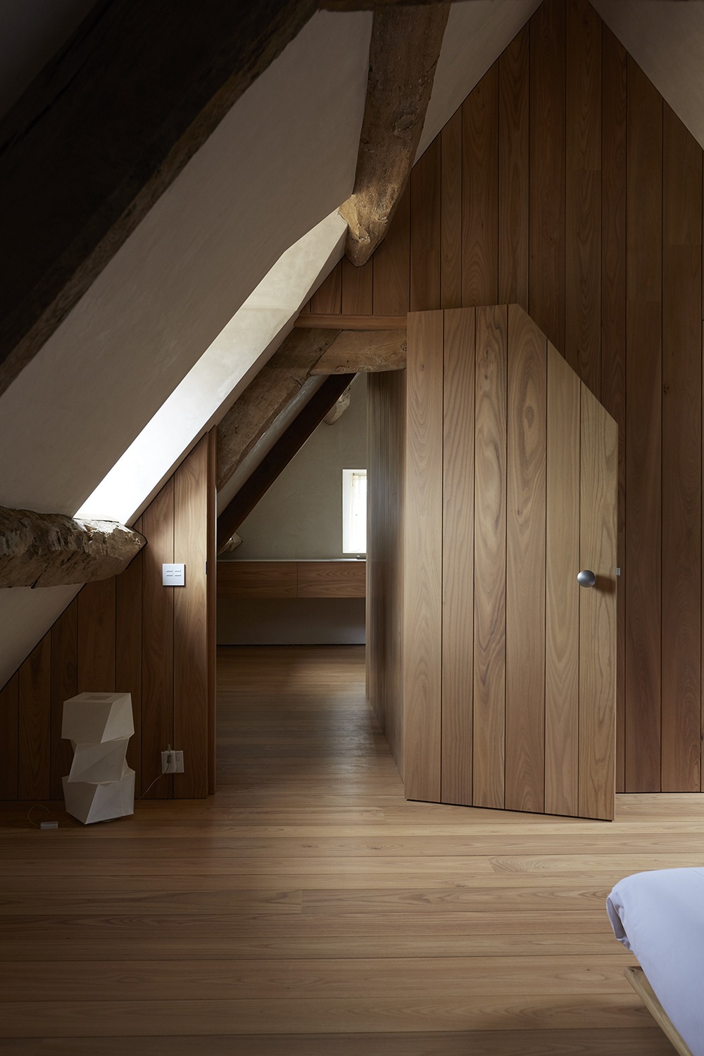
You’ve said that when you sit down to design, you always ask yourself what the ideal version of that thing would be—what it’s all for. What questions did you ask yourself when sitting down to design Home Farm?
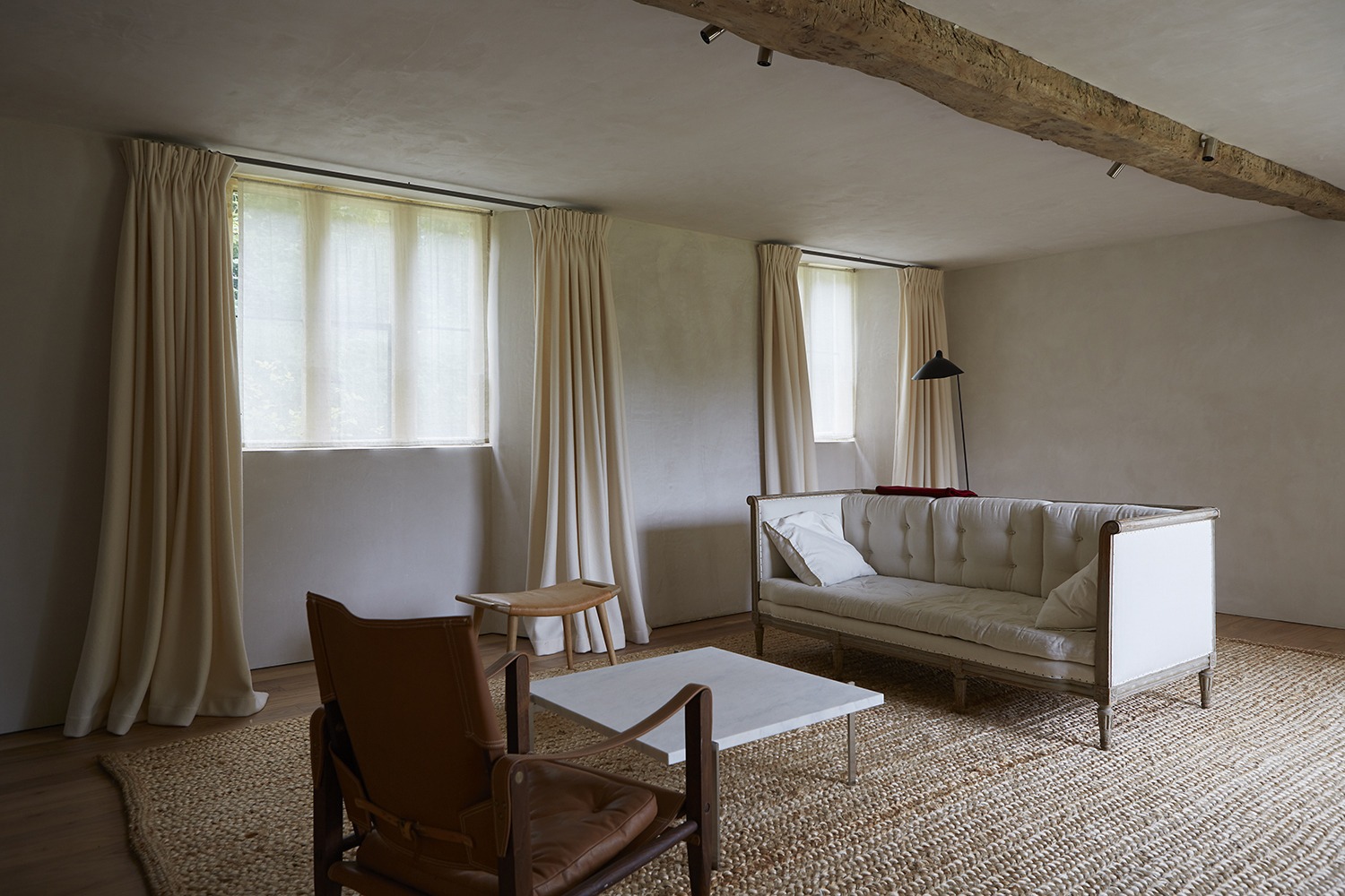
The design of Home Farm was complicated—and enriched—by the fact that there was so much existing architecture. These were mostly found spaces. So, one of the big questions I had to ask myself, and continue to pose throughout the conceptual and construction processes, was how to draw all of the various elements together to make a harmonious formal and functional composition.
Do you tend to view each room as its own space or as a part of a greater whole? How do you balance the two?
I view each room as its own space, but also as part of a greater whole. Each room has its own atmosphere, but in it, there is also an important sense of an unfolding rhythm. At Home Farm, I tend to leave all of the doors open, and at night, I turn a light on in every room so that I can see through and experience them together.
In what way is designing a space for yourself different than designing for someone else?
All of my work feels very personal. When I’m designing for clients, I immerse myself in their lives, in order to understand the character of the architectural space I’m making for them. They always have strong ideas, and they’re very passionate, so I get a lot of drive and energy from them. When I’m designing for myself, however, the creative dia- logue is more internalized. Since there is no third party to satisfy, the only real constraints are time, money, and the tenacity of spirit to keep pushing the thinking. Because I don’t have the same deadlines, I tend to continuously tweak the design. It’s a slow and meticulous process, but architecture itself is a slow and meticulous process.
Minimalism is clearly a cornerstone of your work; would you say that it also plays a large role in your life?
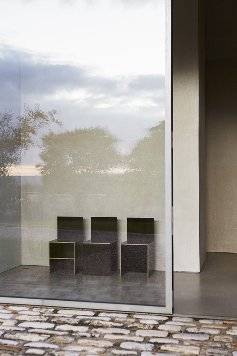
I draw no distinction between my life and my work. I work in a way that makes sense to me, and architecture is a reflection of the way I want to live. Keeping things simple in all walks has been a cornerstone for me.
Playing with mass is another thing you’re known for— how did you approach this when working with an existing structure?
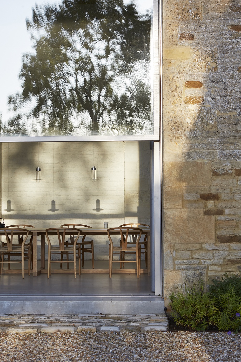
The first time my wife Catherine and I visited the property, I could see the possibilities of inserting a contemporary volume to link the farmhouse with the in-line stone barn, stables, and hayloft, to create an attenuated composition nearly 50 meters in length. This new architecture contrasts the transparency of glass with the color, mass, and texture of the surrounding stone and brick. This then allows the thickness of the original stone walls—their mass—to be visible in every opening.

You’ve said that this property isn’t an obvious place for someone interested in the practice of subtraction—how did you overcome the challenges that came with this?
The inherited architecture—a combination of domestic and agricultural structures from the 17th, 18th, 19th, and 20th centuries—was complex and of strong character. While I had a clear sense of what I wanted to achieve, I needed to do it without losing what had been visually, spatially, and atmospherically exhilarating about the original site. Much had to be decided on a case-by-case basis. In circumstances like this, there are endless small decisions, which cumulatively have a huge impact.
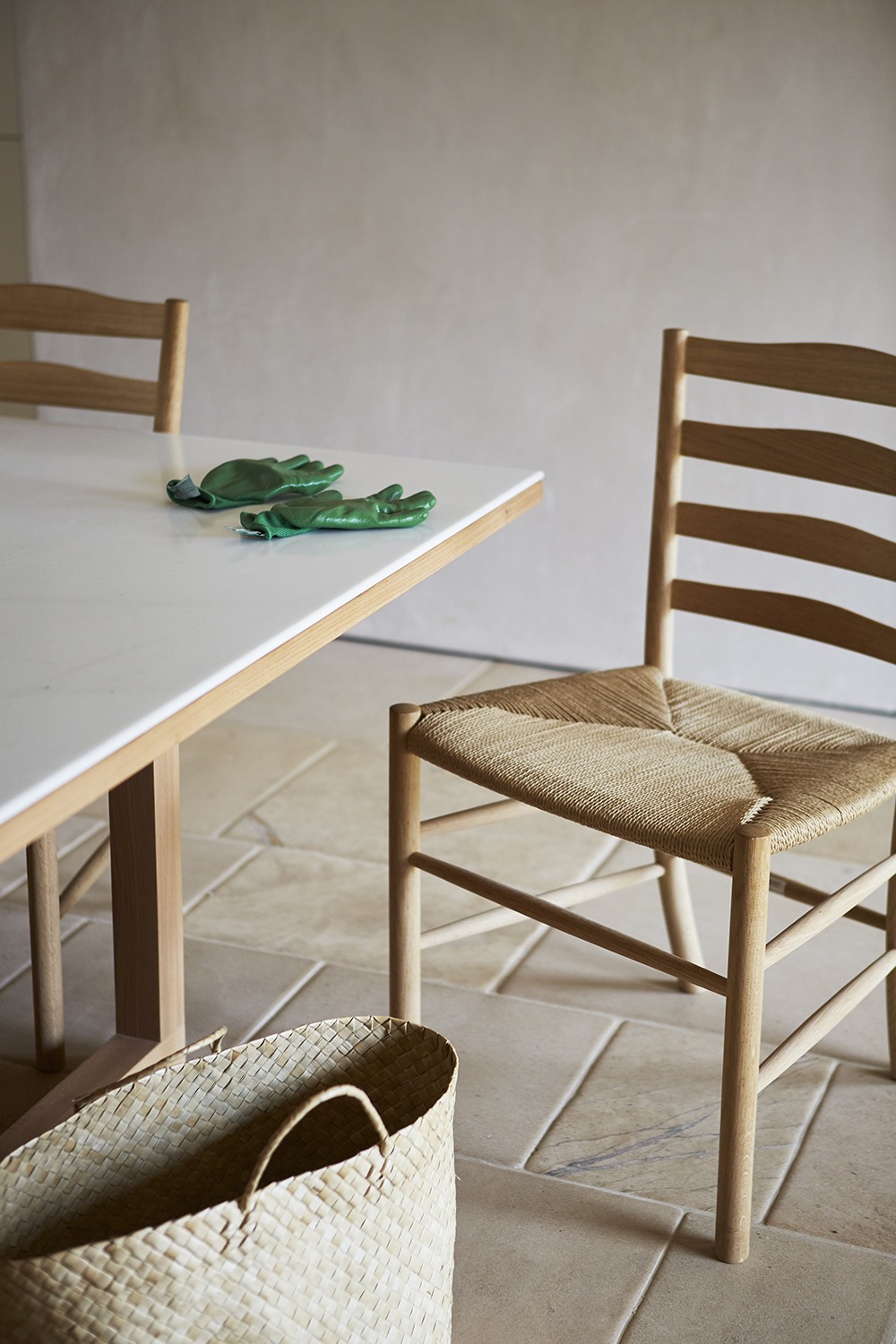
How did you play with the tension between old and new in this design? What aspects of the original property were important for you to honor?
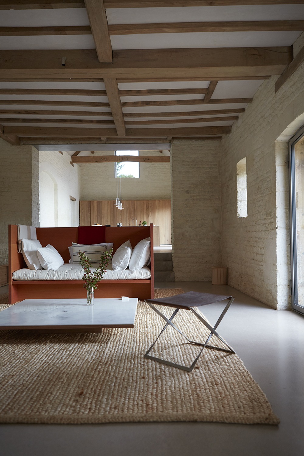
For me, it was important not to smooth over the connections between the old and new. It’s good to remain conscious of the transitions—to avoid any false historicizing. I didn’t want to lose the essential “disordered” character of the place, with its eccentric accretion of structures.
How did you decide which materials to use?
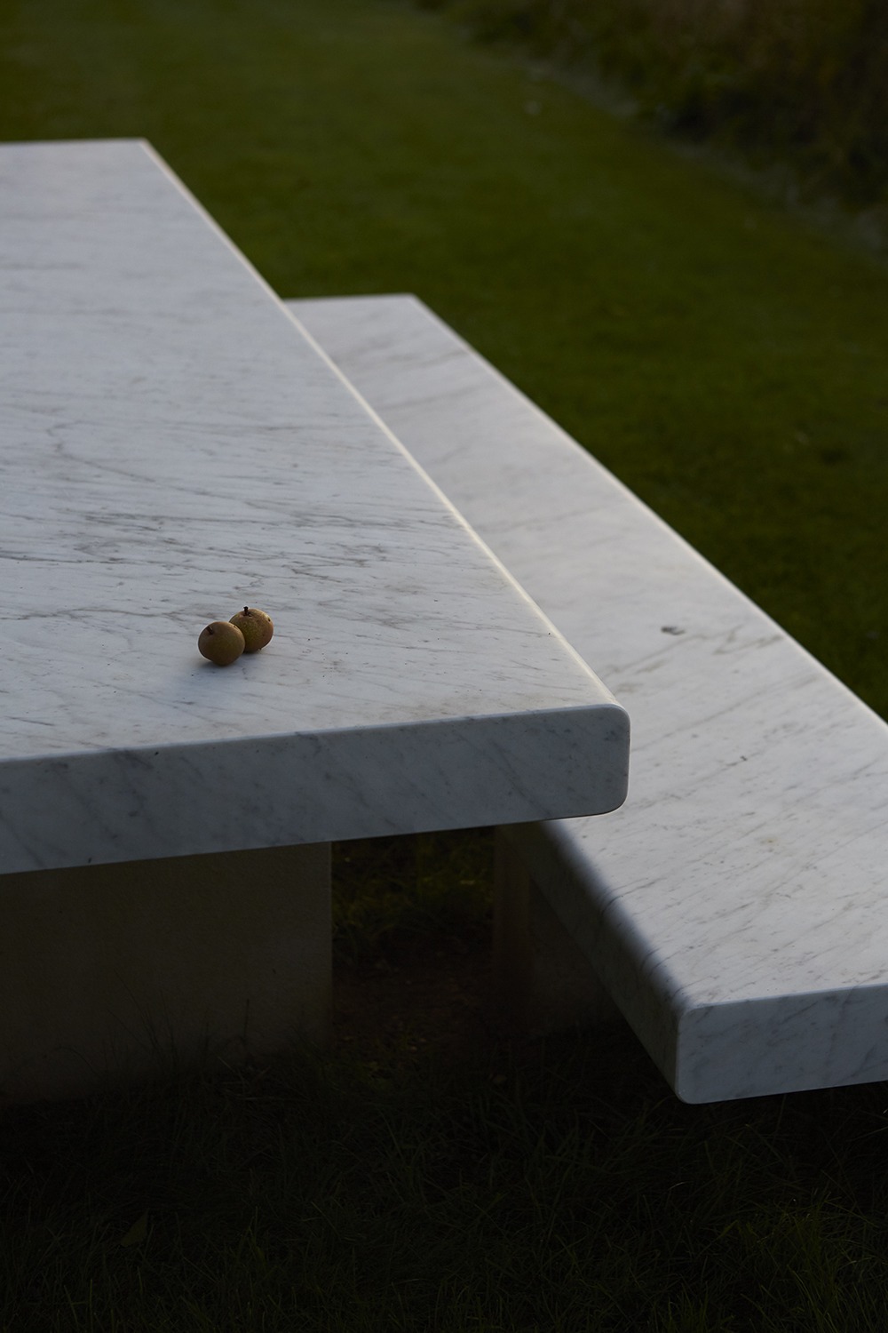
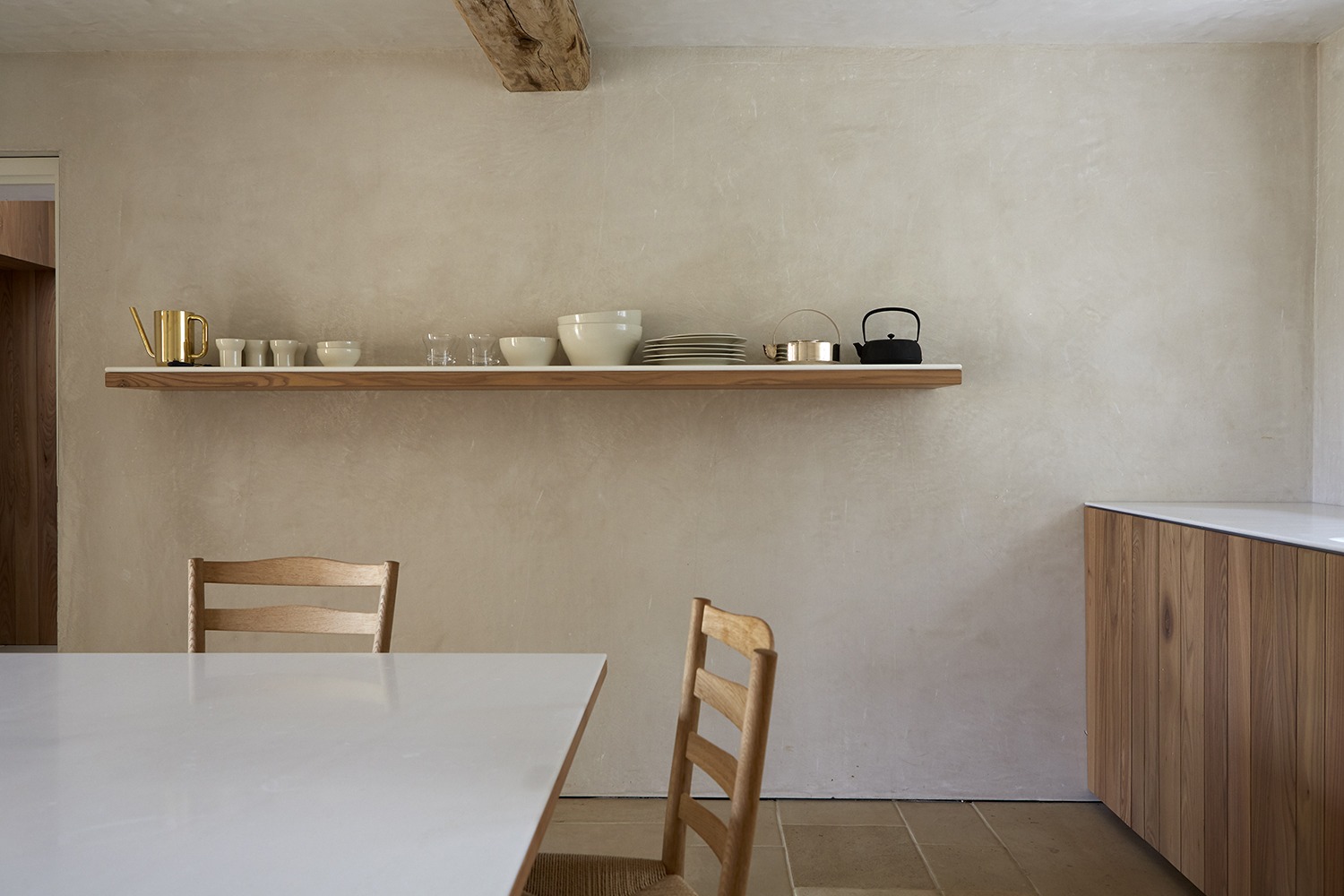
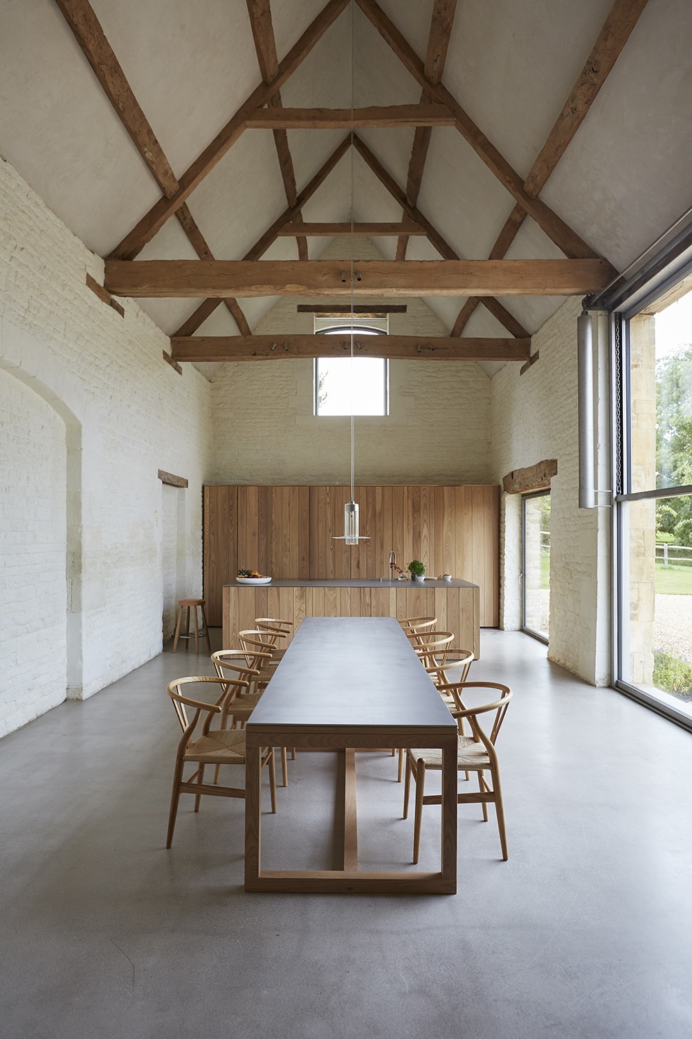
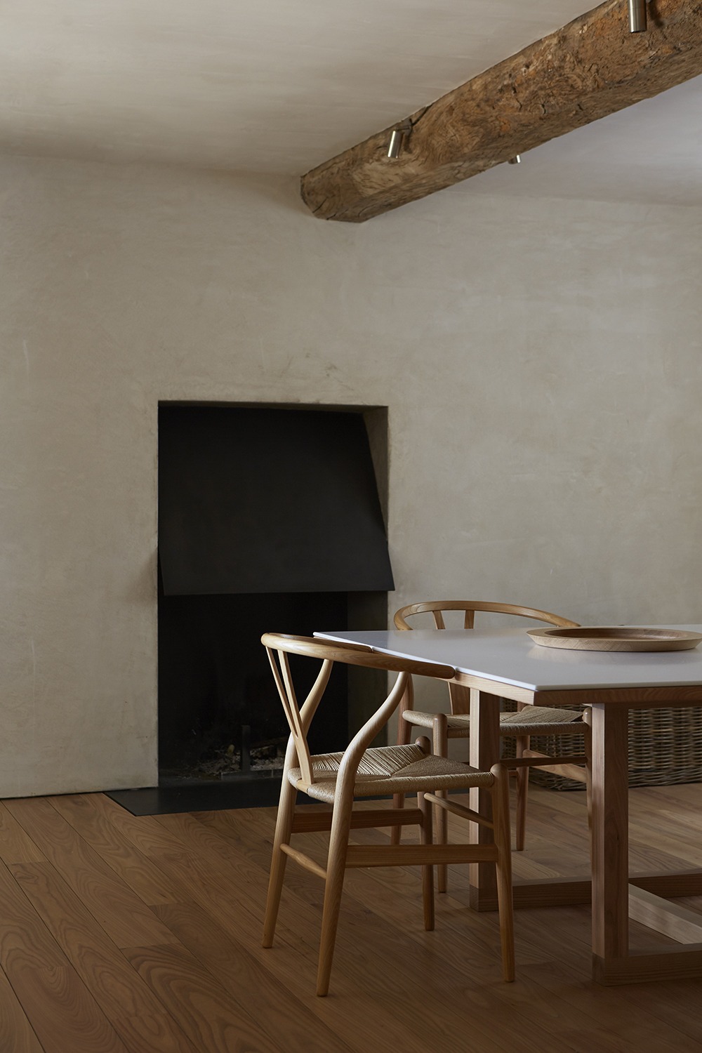
Catherine and I chose to keep the palette simple: lime plaster walls and ceilings; elm and concrete floors; lime- washed stone walls; exposed elm beams; raw stainless steel window frames, lintels, sills, hinges, and doorknobs; and pure, white marble from Lasa in the Dolomites. When laying out the borders of the landscaping, Catherine also planted more trees and patches of meadow flowers. It’s a farmhouse, so we wanted specific details to truly reflect this.
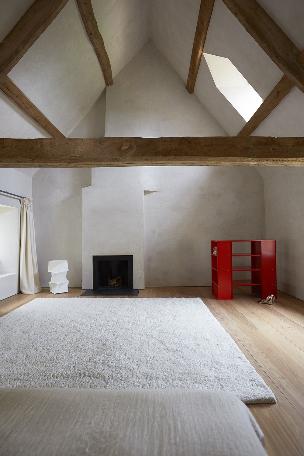
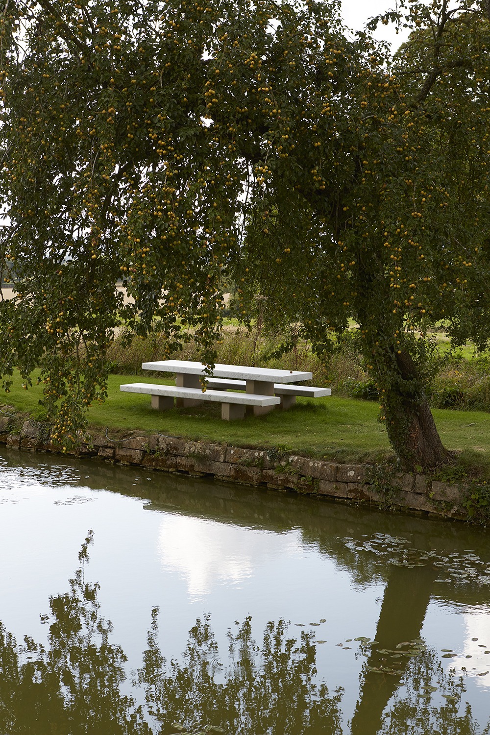
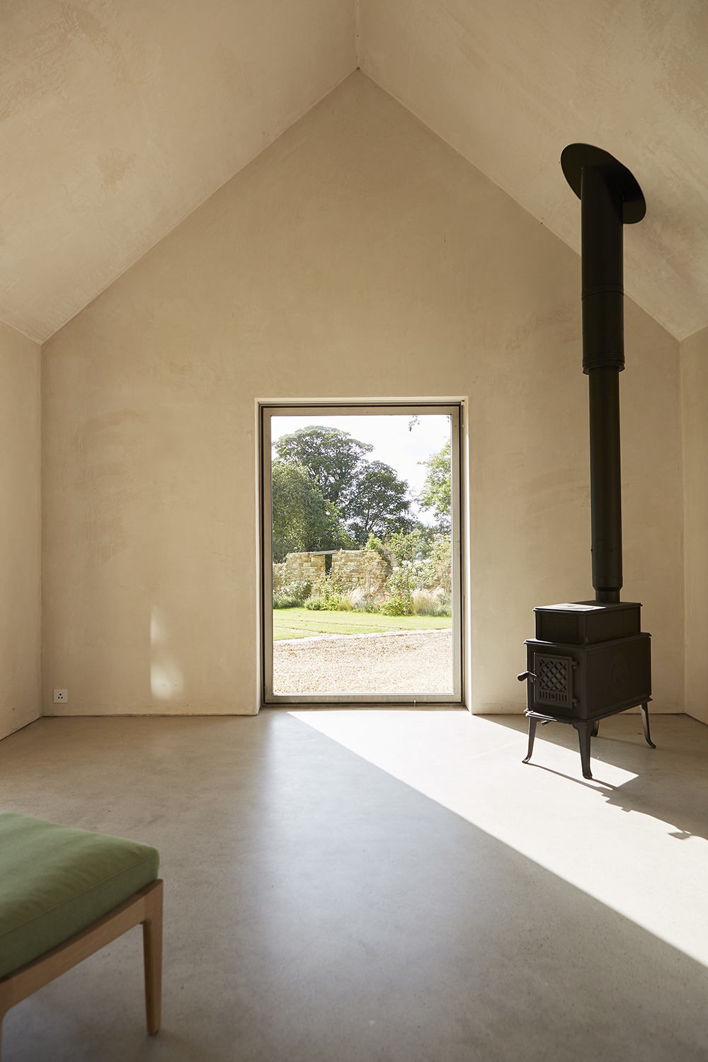
Did you design any of the furniture, appliances, or textiles in the house as well?
I always prefer to design in response to a particular need, and I knew that this project would act as a powerful crucible for the elements still missing from the Pawson inventory— everything from outside tables and benches to light fittings and textiles. It’s an ongoing process balanced between when a need is identified and when I have a spark.
Do you and Catherine have similar tastes?
Catherine and I are both interested in space that feels comfortable to be in. While it’s true that her preference would be for the odd additional sofa and throw, where my instinct is for sparer spaces, 30 years of marriage and the making of three homes together are testament to a fundamentally shared vision. We’ve made a pretty good job of making it work. Or at least, she has!
Is there a certain space at Home Farm that you gravitate toward or feel is particularly special to you?
I’m still enjoying exploring the different characters of the spaces, watching how the light changes according to the season and the time of day. It’s important for me to try to get every space to feel nice and calm. Architecture is simply a container for human movement—the goal is always to get to the point when I’d want to wake up in any of them.
Delve deeper into John’s practice in his latest book Anatomy of Minimum, published by Phaidon.
