
Getty Center
Magnificent Resolution
Los Angeles is a place where people come to make things happen. The city itself as a visual landscape is, indeed, a vast expanse of that which is man-made: suburbs, freeways, neons—even the ubiquitous palm trees were brought here by humans.
Surprisingly, that entrepreneurial spirit hasn’t resulted in numerous architectural landmarks, but if you ask Angelenos and if you look on Google Maps, the Getty Center will stand out. Perched atop a hill, this literal powerhouse of the art world is Richard Meier’s masterpiece: A daring and hypnotic building—and just like the city where it belongs, a triumph of willpower.
This year marks the Getty’s 25th anniversary, but its story begins much earlier. At first, there was J. Paul Getty. The industrialist and self-made billionaire spent a part of his fortune on an art collection, exhibited on the grounds of his own home (now known as the Getty Villa). After his death in 1976, the J. Paul Getty Trust was created as an umbrella that encompasses several entities with the mission of protecting, exhibiting, and encouraging art around the world. To host them all, a campus was envisioned, and so in 1997, the Getty Center was born.
Paul Getty’s name is inescapable, but the Getty Center as an architectural space is synonymous with Richard Meier. The American architect won the Getty competition in 1984, the same year he was awarded the Pritzker Prize. Meier’s vision was bold—so much so that it would take more than ten years to come to life. As Julie Jaskol, the Trust’s communications assistant director, tells me, “It was an extremely complex process. They chose a location surrounded by wealthy neighborhoods who were very adamant about what they would and wouldn’t allow.”
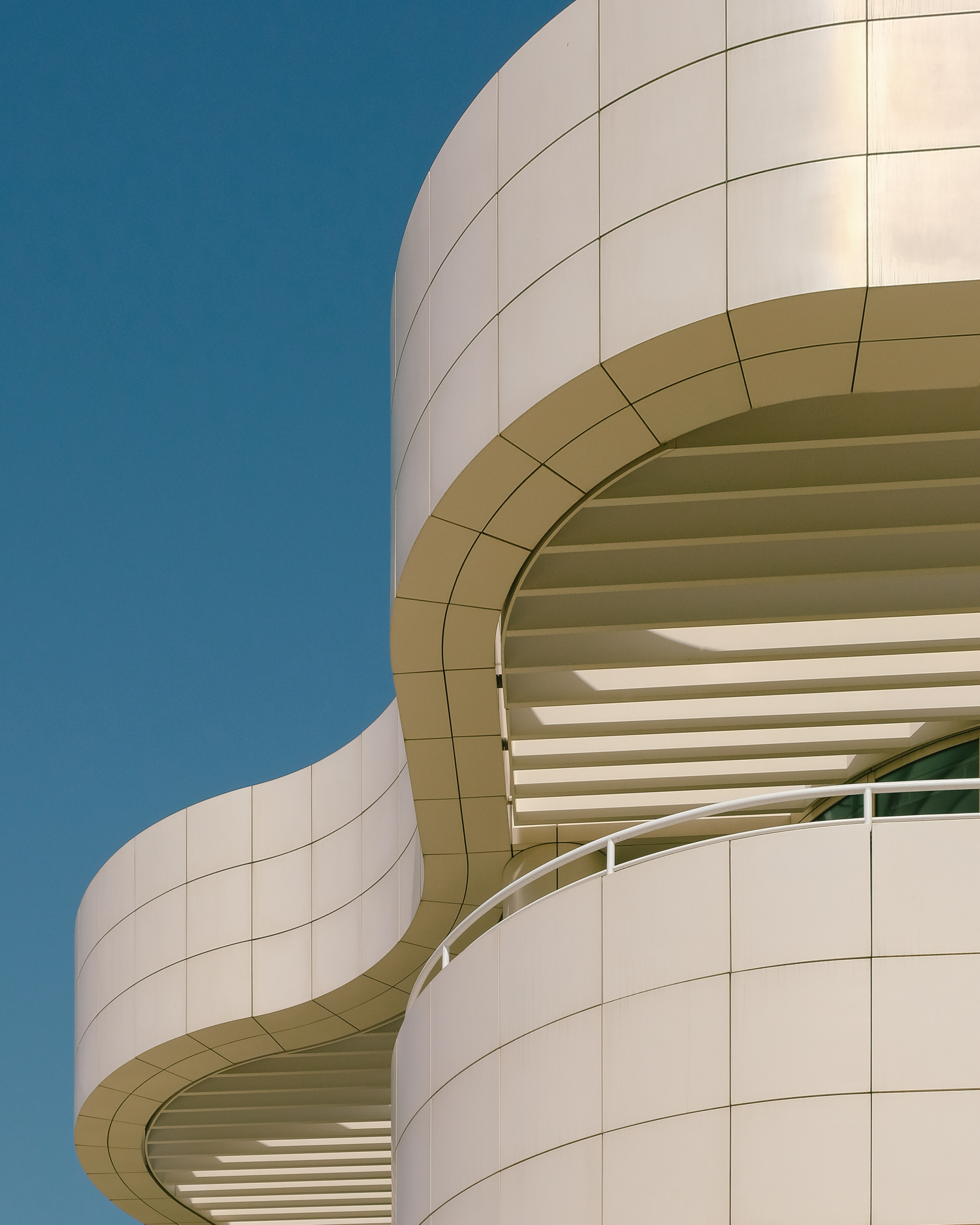
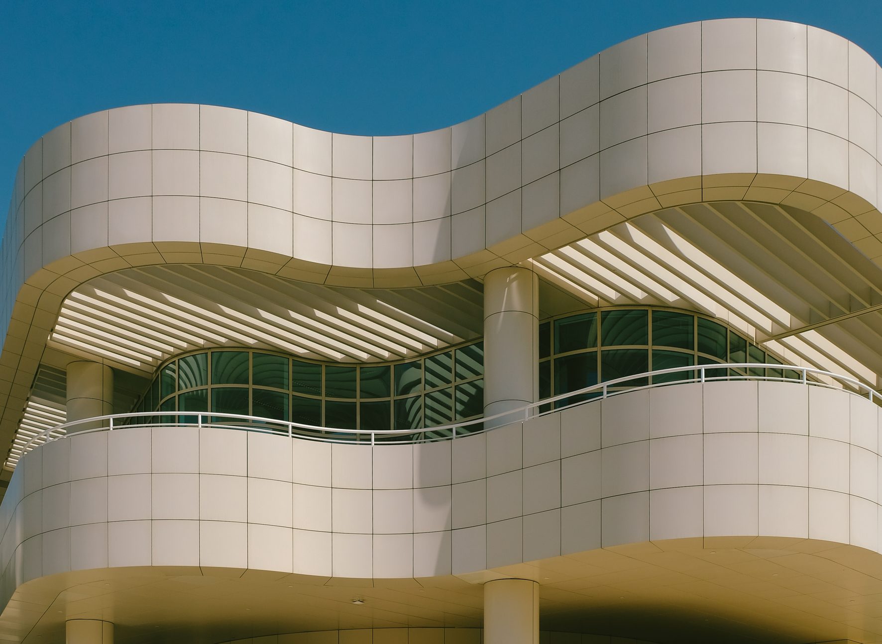
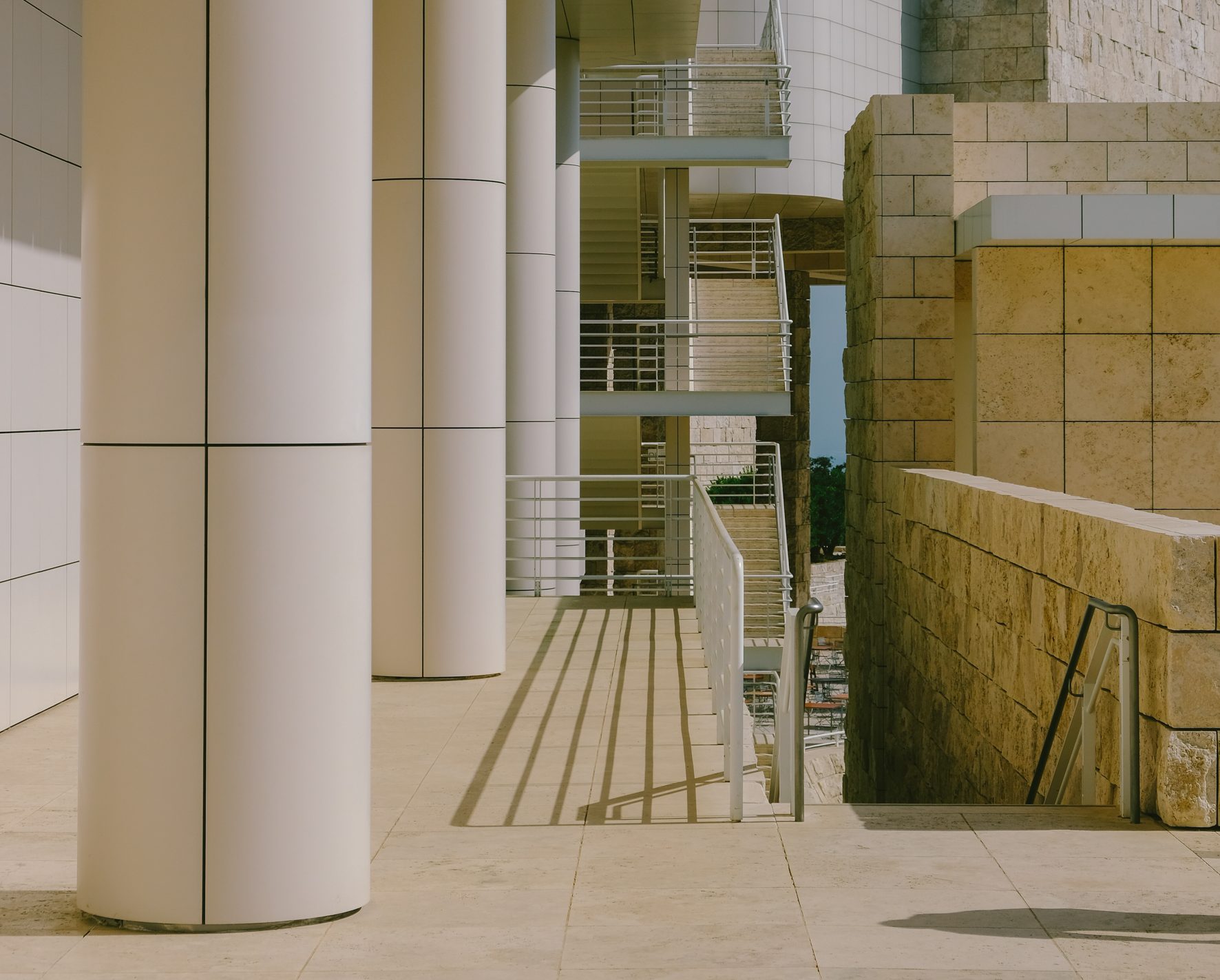
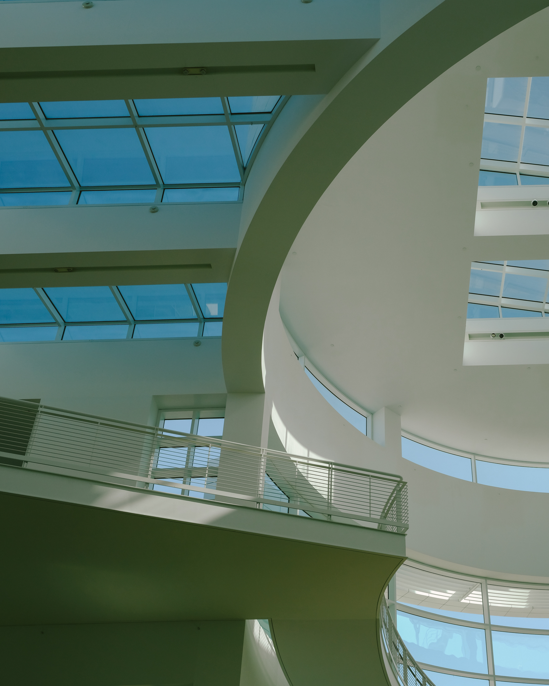
The space consists of two overlapping grids following the axes of two pre-existent ridges. On each grid, a succession of blocky buildings that host exhibition spaces, offices, and auditoriums, among other functions, is connected through walkways, rotundas, walls, terraces, and ramps, structured on different levels and surrounded by the gardens. It’s a twisting succession of curves and straight lines, hermetic white surfaces, and revealing glass windows.
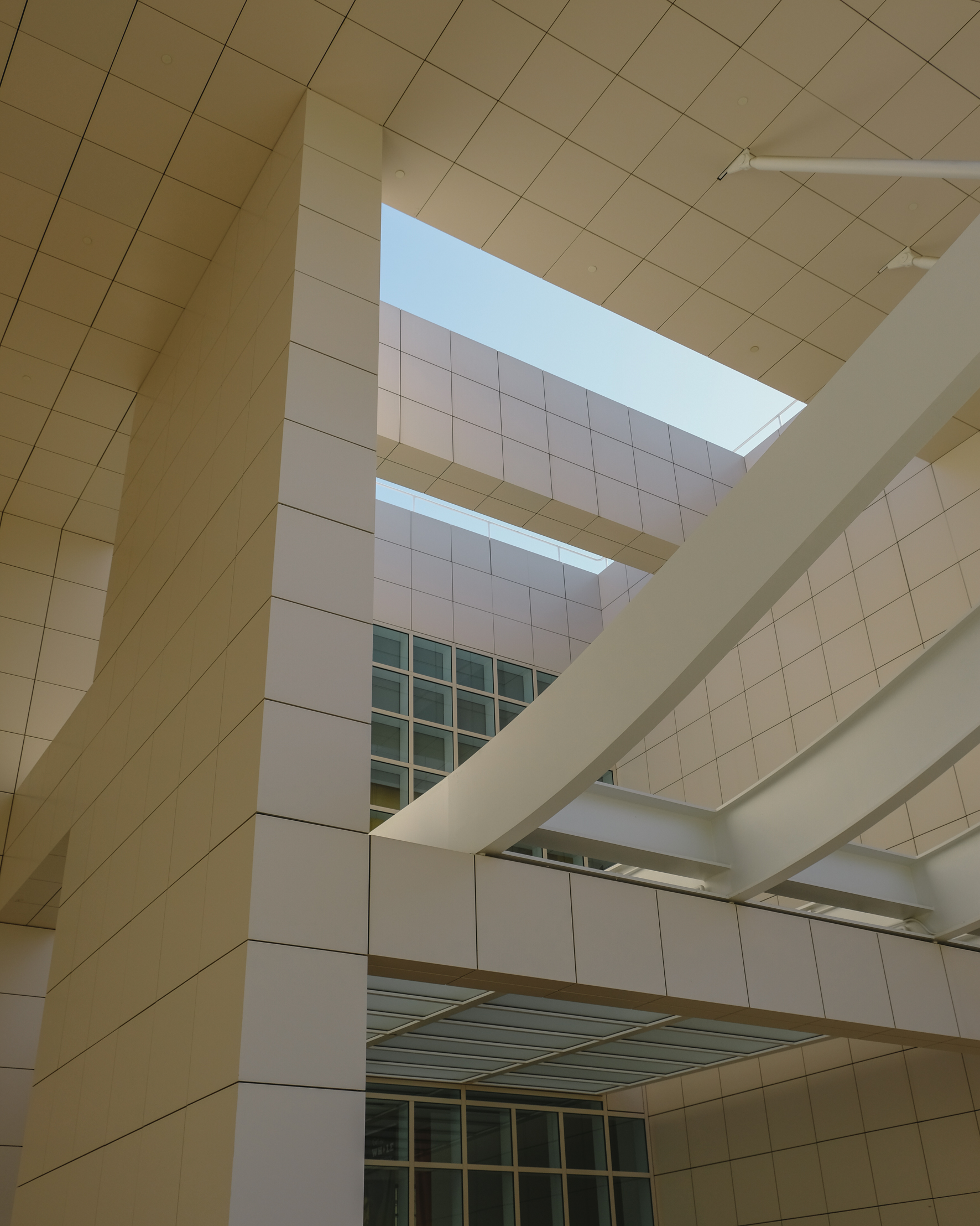
The overall structure, while minimal in its aesthetic, is hard to grasp, not only from afar but also from within. “It takes years to know exactly where you go. Not long ago, I wandered onto that balcony for the first time, and I went, ‘Oh, I had no idea this was here!’” laughs Jaskol. Meier was notoriously against signage, and that predisposition to make the visitor work is what makes the navigation of the space a deliciously confusing experience, constantly leading to unexpected discoveries. The interior, much darker and more classic (the museum hosts a mainly European art collection), has an equally counterintuitive layout that offers, however, breaks and moderation. In fact, this is one of the space’s tantalizing characteristics: It is monumental, yet one never feels like the scale is excessive.
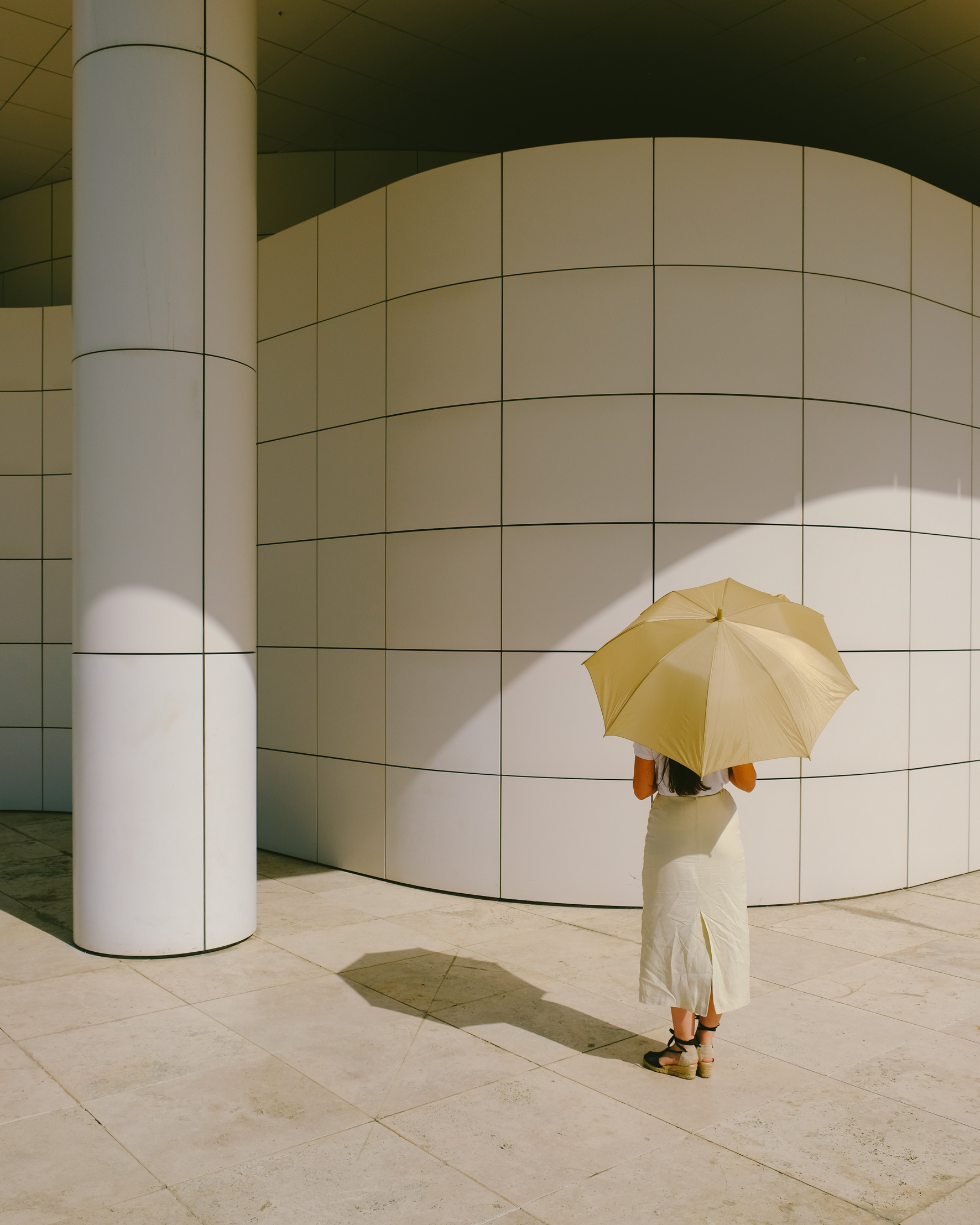
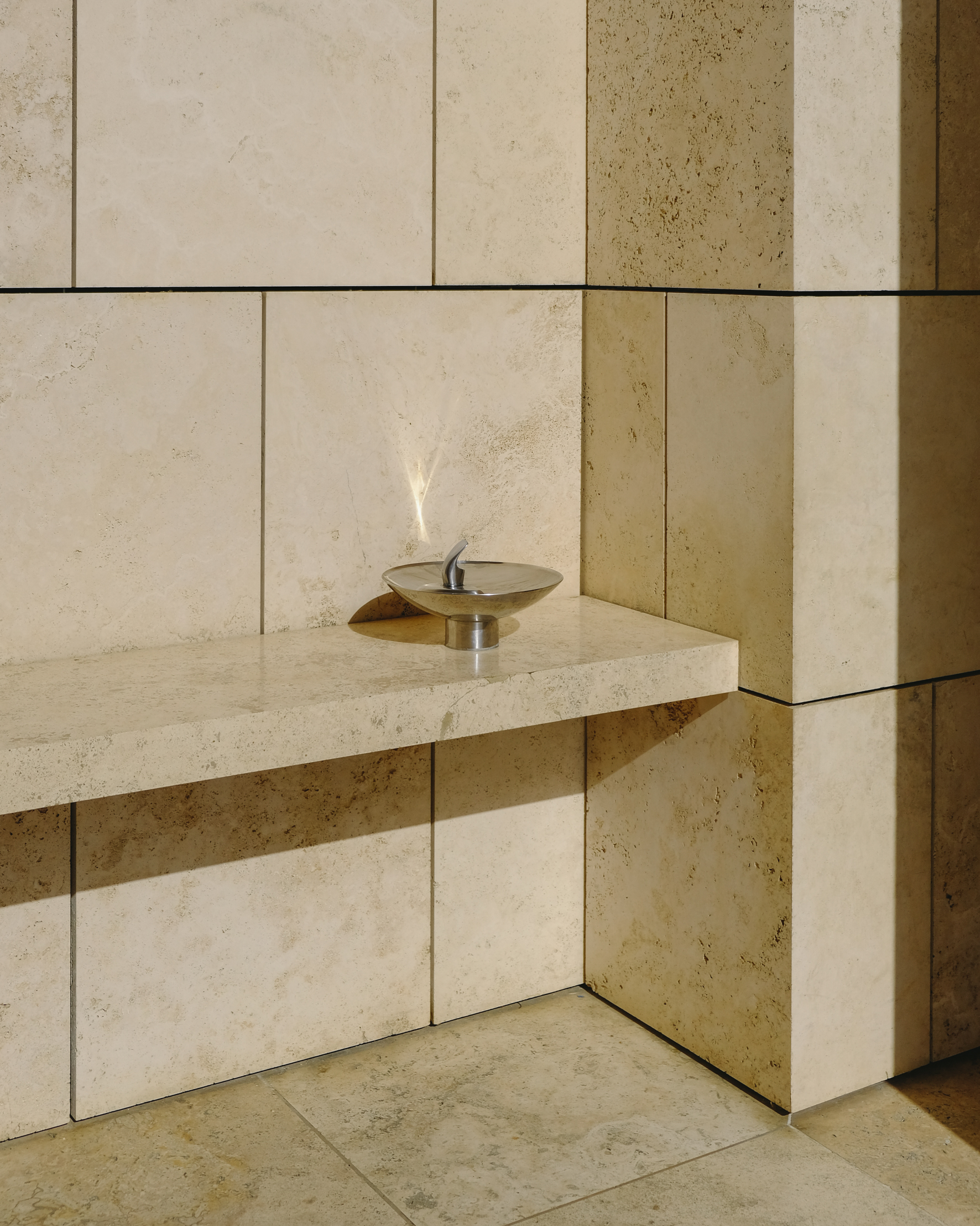
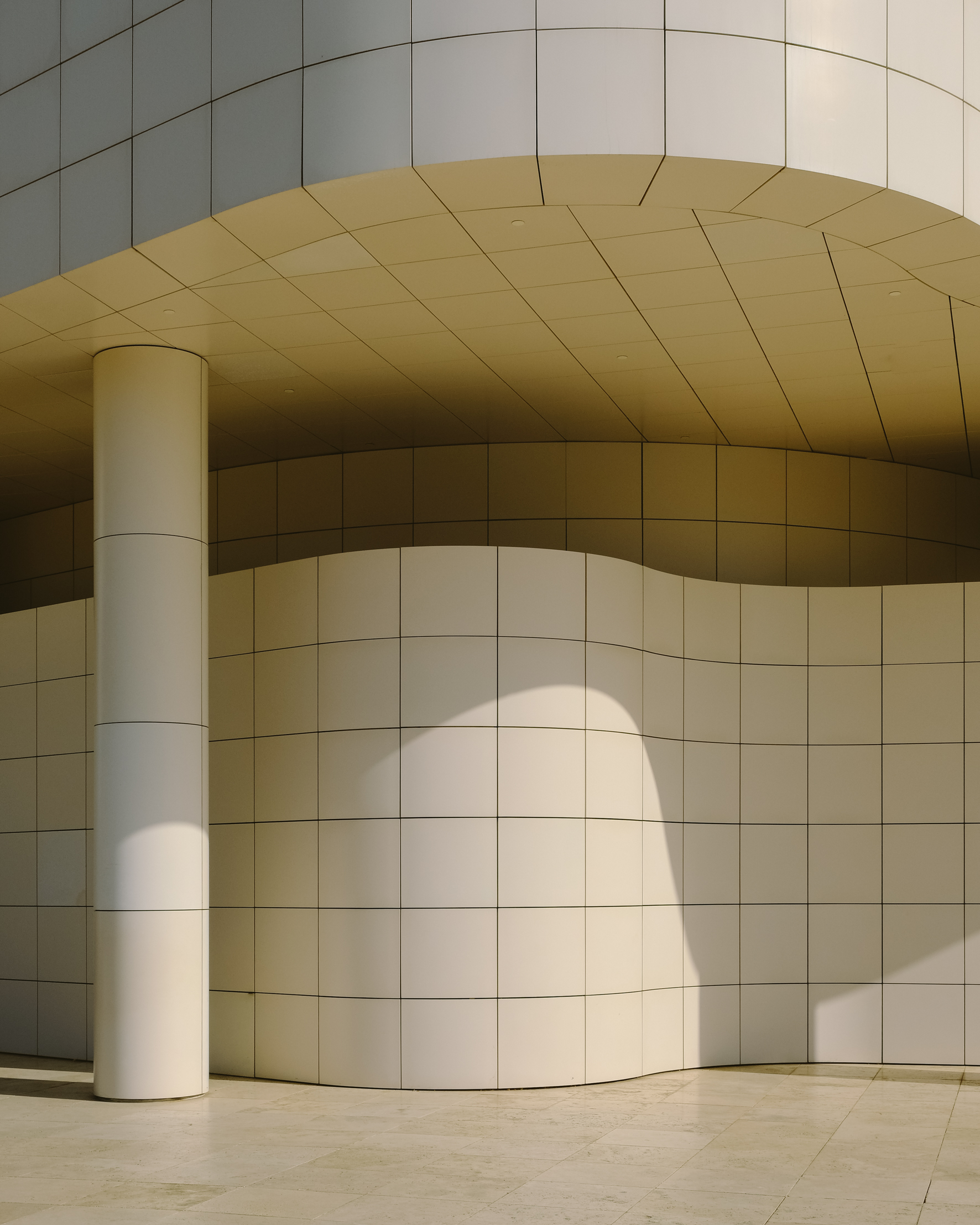
The complexity of its structure is one of the defining features of the Getty, the other being the pristine white, a Meier signature. However, this was one of the things neighbors opposed at first. “On the inside facing in, you can see what we call Richard Meier-white, but everything that faces outside is more of an earthy tone. That was to mollify the neighbors. It’s funny because if you advertise your house with a Getty view now, it’s great, but then they were terrified that they might see it,” observes Jaskol. The color comes from the Italian travertine cladding. The overall effect is dazzling and refined, almost temple-like, but there’s an organic quality to it at the same time—perhaps thanks to the craggy roughness of the stone, which Meier purposefully preserved.
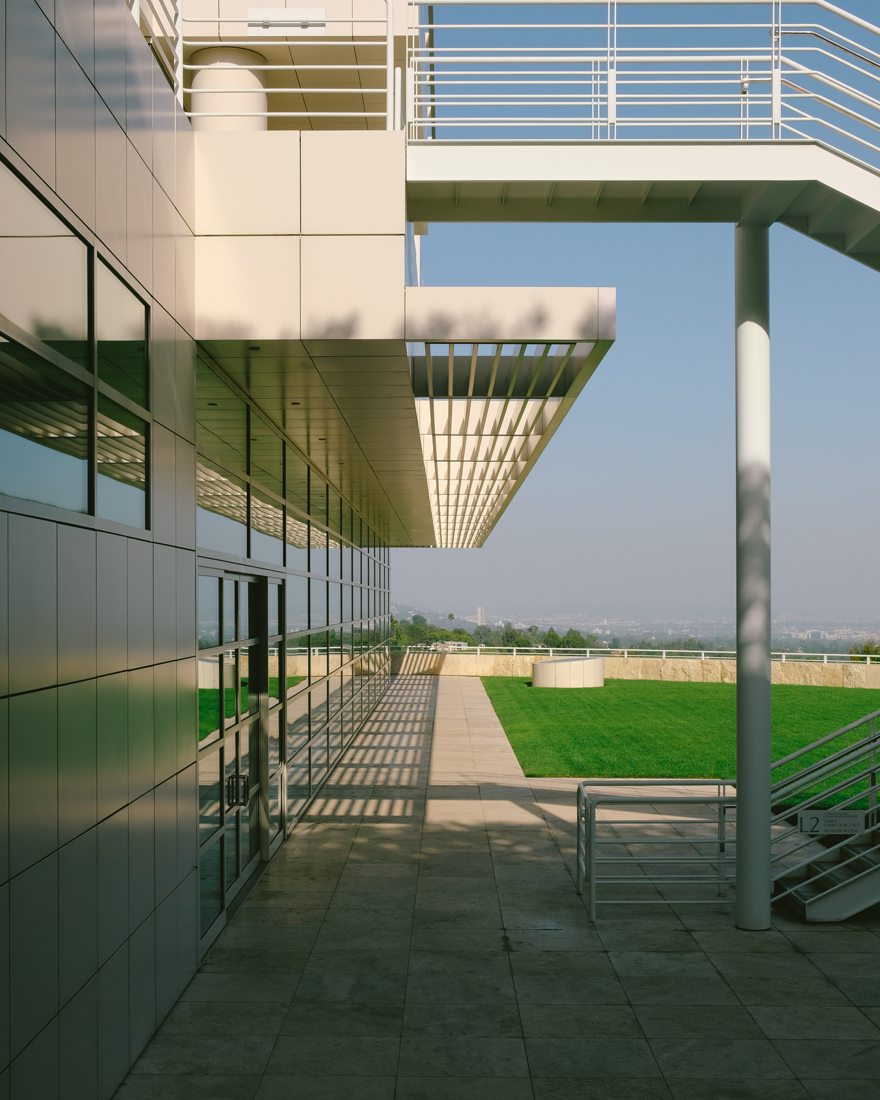
The architect’s determined vision is at the heart of the Center’s every detail. It was captured in the documentary Concert of Wills, which narrates the ego battles surrounding the construction. Perhaps most notoriously, the antagonism between Meier and artist Robert Irwin, who replaced him as the landscape designer of the space. “Meier planned to have a promenade out to a viewpoint raised up to maximize the view. And Robert Irwin sunk the garden: He did the exact opposite,” Jaskol says. Today, you wouldn’t know about that contradiction—people meander inside and outside with equal ease and fascination.
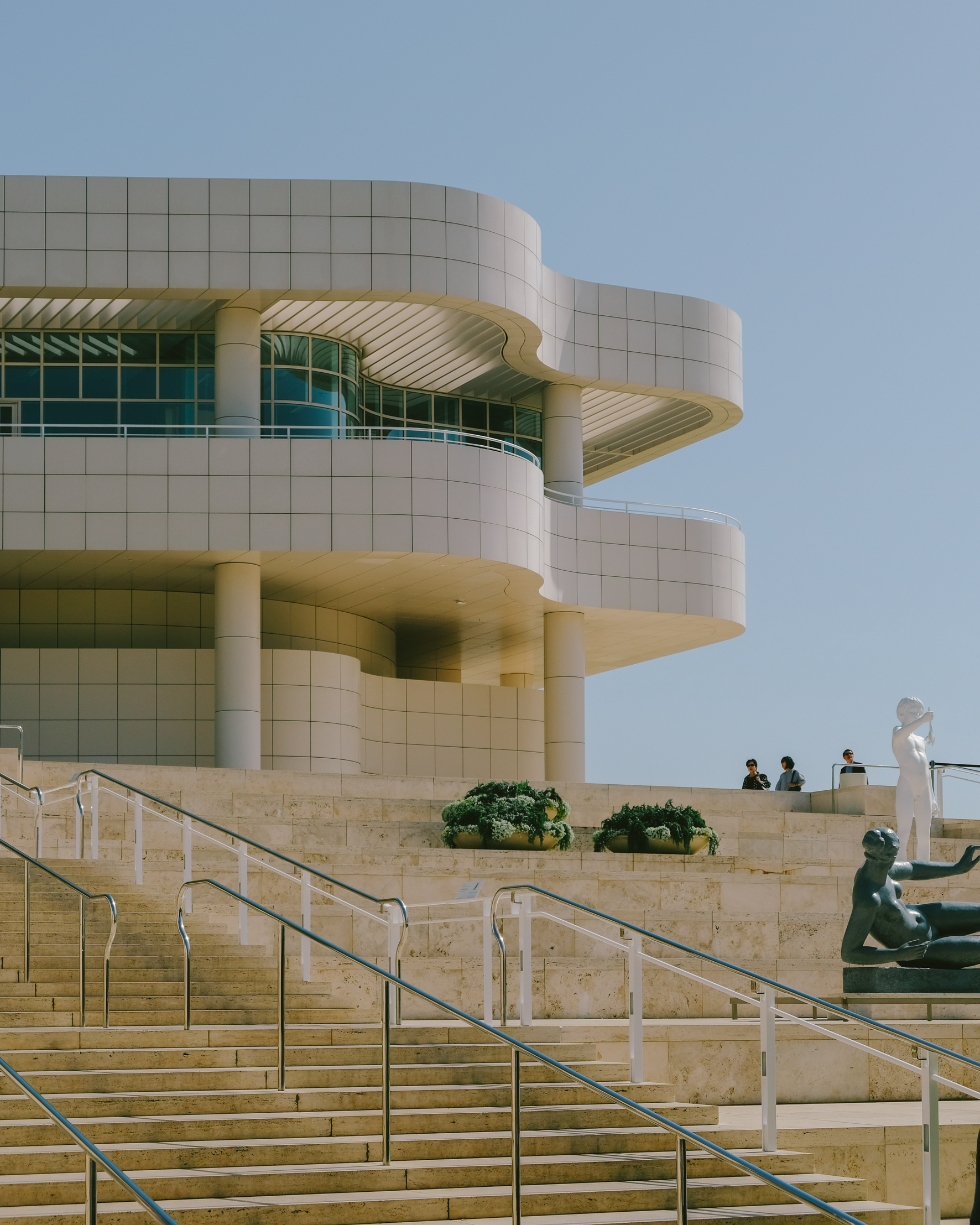
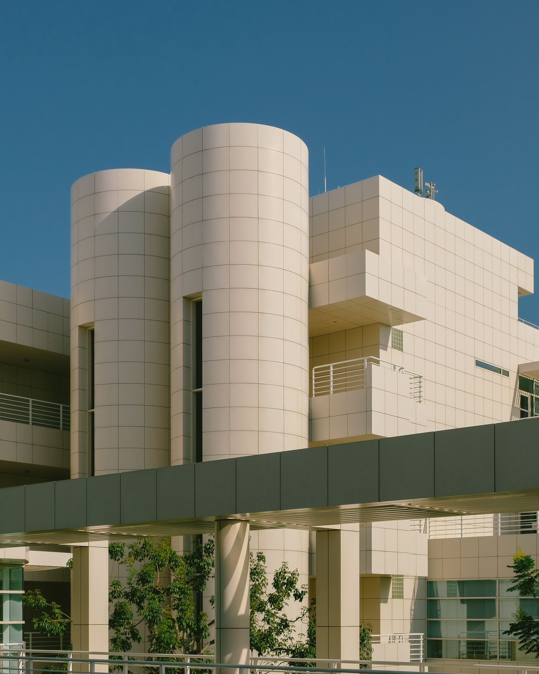
The Getty is a success, as a space that welcomes millions of visitors every year and as the referent that propelled a civic architecture boom within the city. The tensions behind it are just another part of what makes it what it is: resplendent, driven, contradictory, bright yet opaque. Human, after all.


