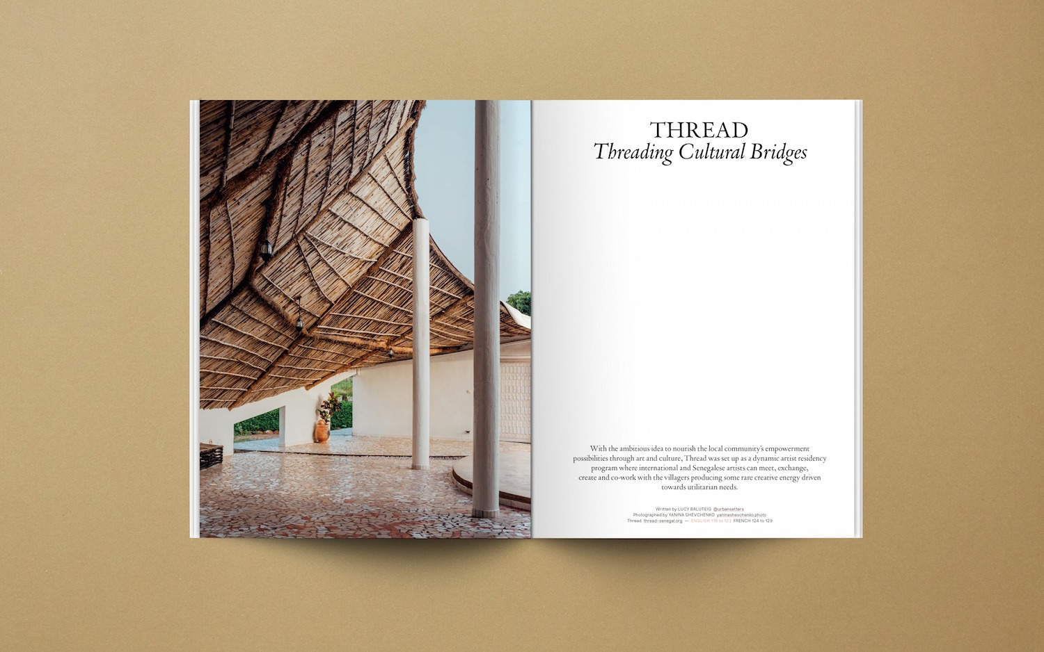
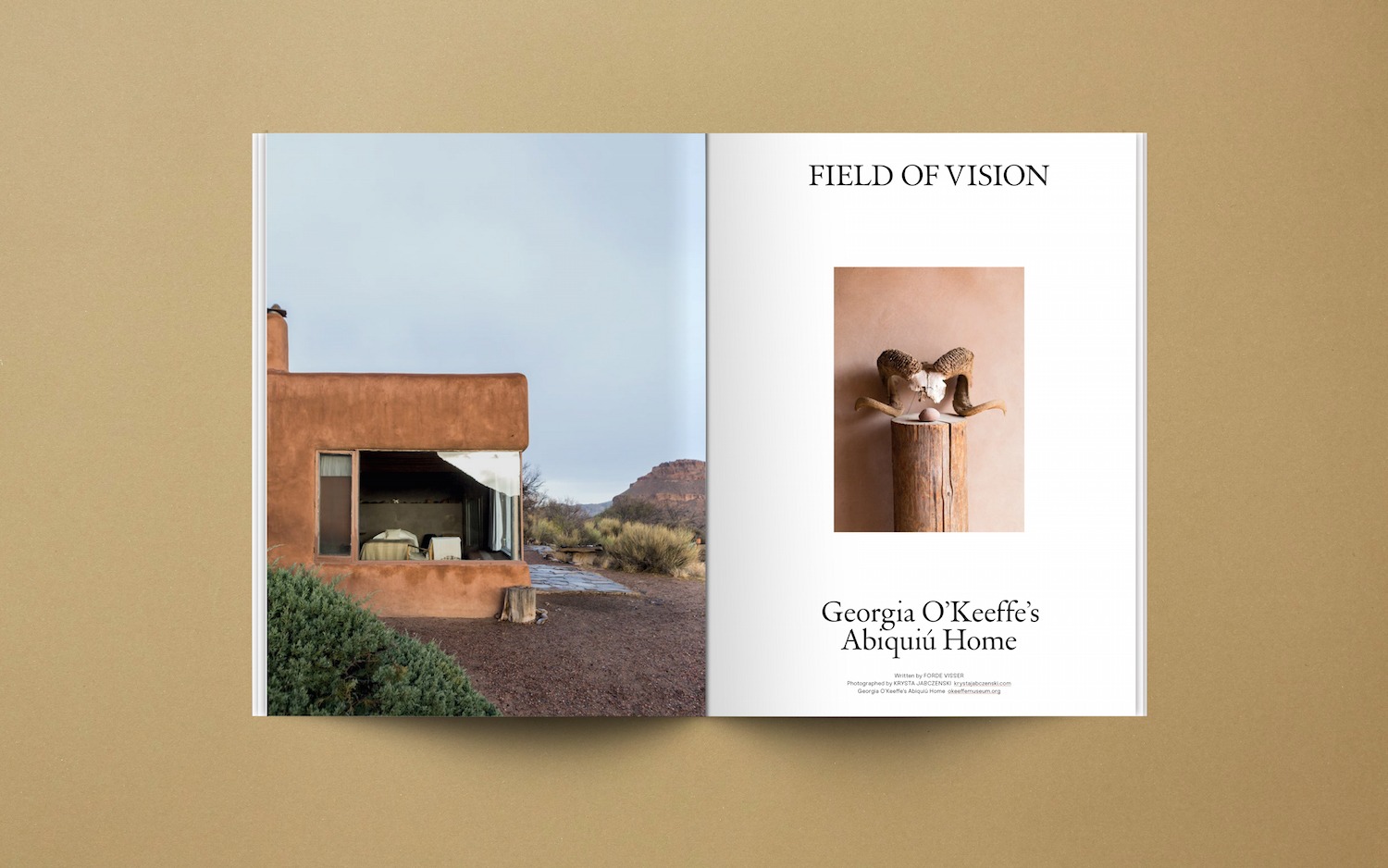
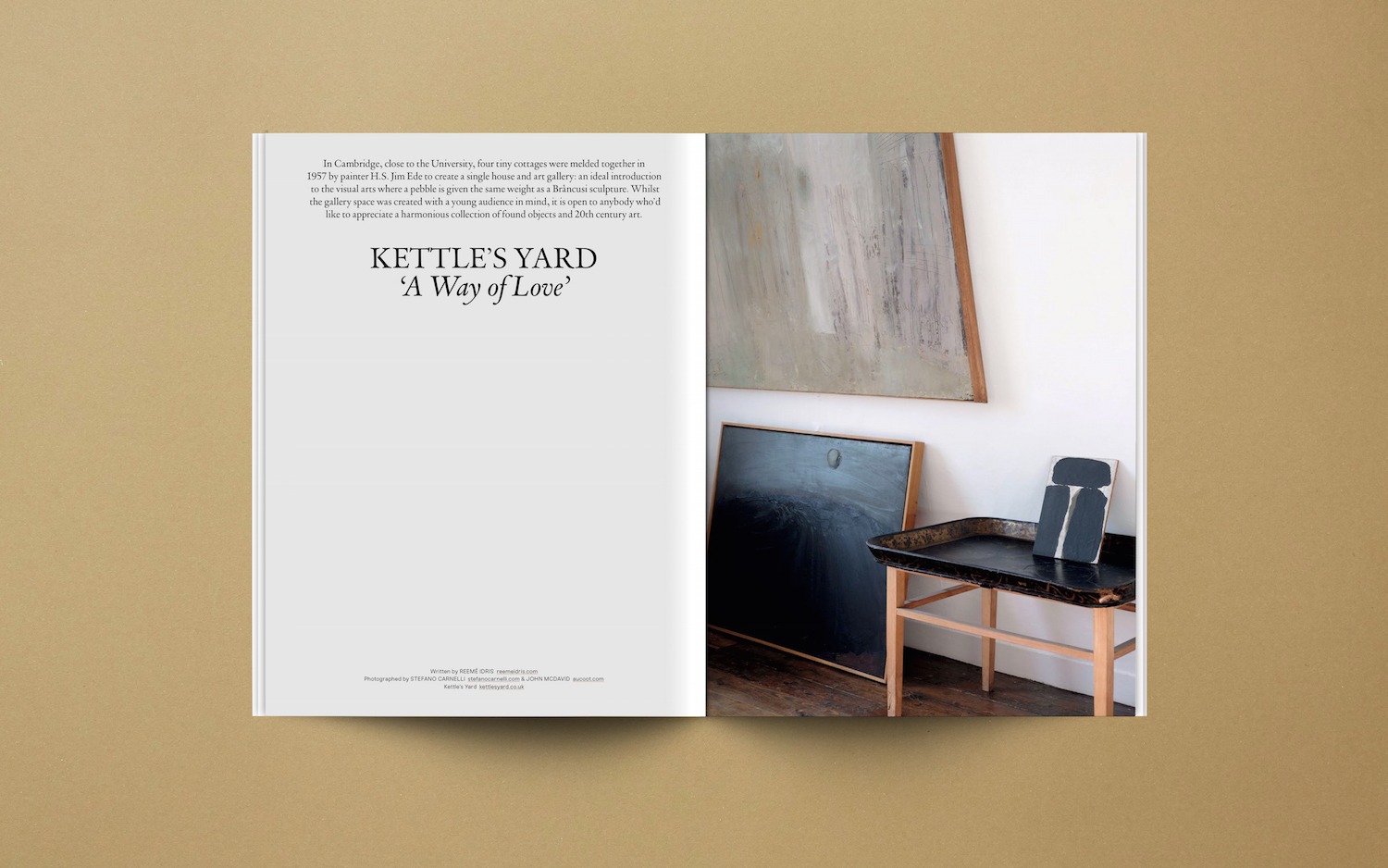
Folch Studio
Building Together a New Identity
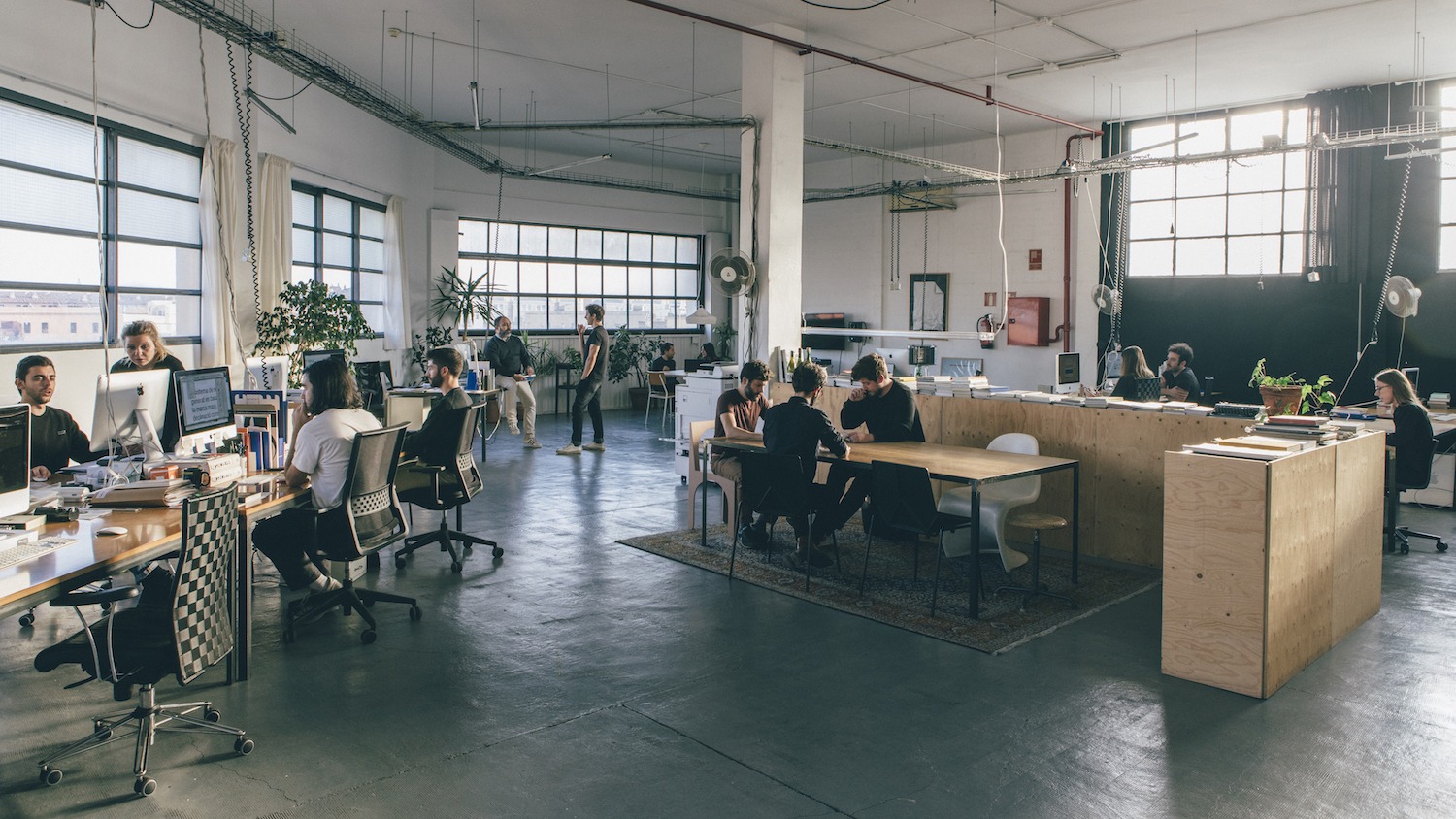
Openhouse has gone through exciting growth this year. In our ever-expanding project to bring you inspiring and beautifully presented stories, we asked Folch to help us to build a new identity that, without forgetting our roots, could lead us to the next level as magazine and as studio. With their collaboration, a new look of the magazine and new website was born.
What is Folch’s design trademark? (What does Folch stand for)
For us, graphic design is a communication tool that allows our clients to become more competitive and achieve greater success as a business. We believe that a strong narrative and strategy is as important as the design itself – and this often comes across in our work. Design and art direction translate business values into visual language. In an era where people seek emotional engagement with information, the format given to a message shapes the way it is perceived. With this in mind, meticulous attention to detail is definitely a Folch trademark, even as far as understanding different materials and their finishes.
Which function should a good design fulfill?
Design can’t just be beautiful – it has to be functional, adaptable, unique, timeless and innovative – as well as aesthetic. We always try to see the bigger picture. If something intrinsic is missing at the foundation of a design, there is no real point in designing it. Design should capture the essence of a brand and in doing so add value to the business.
What brought Folch to work on the new identity of Openhouse? (What brought Folch and Openhouse together)
We’ve been working with Andrew and Mariluz from Openhouse for a while now, and even though they had already turned Openhouse into an established brand, they wanted to bring it to the next level. In order to become a creative agency, the magazine needed a digital platform and stronger identity. This was a great opportunity for us to build a stronger relationship.
A magazine today is capable of embodying a recognizable style and set of values transferable to a range of different formats, such as video, photo, digital content, even events. With this more multidisciplinary format, the challenge was to develop a stronger identity with a more consistent brand narrative as the publication breaks away from traditional periodicity and takes on greater flexibility.


What are the priorities for the new design of the magazine and website?
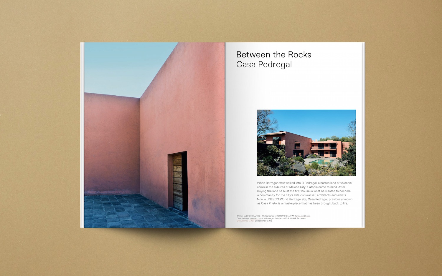
Printed magazines are meant to be read in peace, allowing for depth of content and beautiful imagery to sink in. Because of Openhouse’s weighting towards text, enriching the reading experience was our first priority. This involved a change in terms of typography, replacing the old fonts with a combination of the humanistic Sneak and the Dutch classic DTL Vandenkeere. The text size increased to reflect the soft voice of the brand, and the logo became more organic. We wanted to give the cover a more balanced, and thus more beautiful and commercially attractive, feel. We also gave the magazine a new skin: a coated and embossed paper that softens as it ages.
For the website we incorporated different templates to allow for new content: digital exclusive features, a video section and a webshop. Both house typographies can be used differently in every template, so every post can be adapted to the typology and character of each publication on the website.
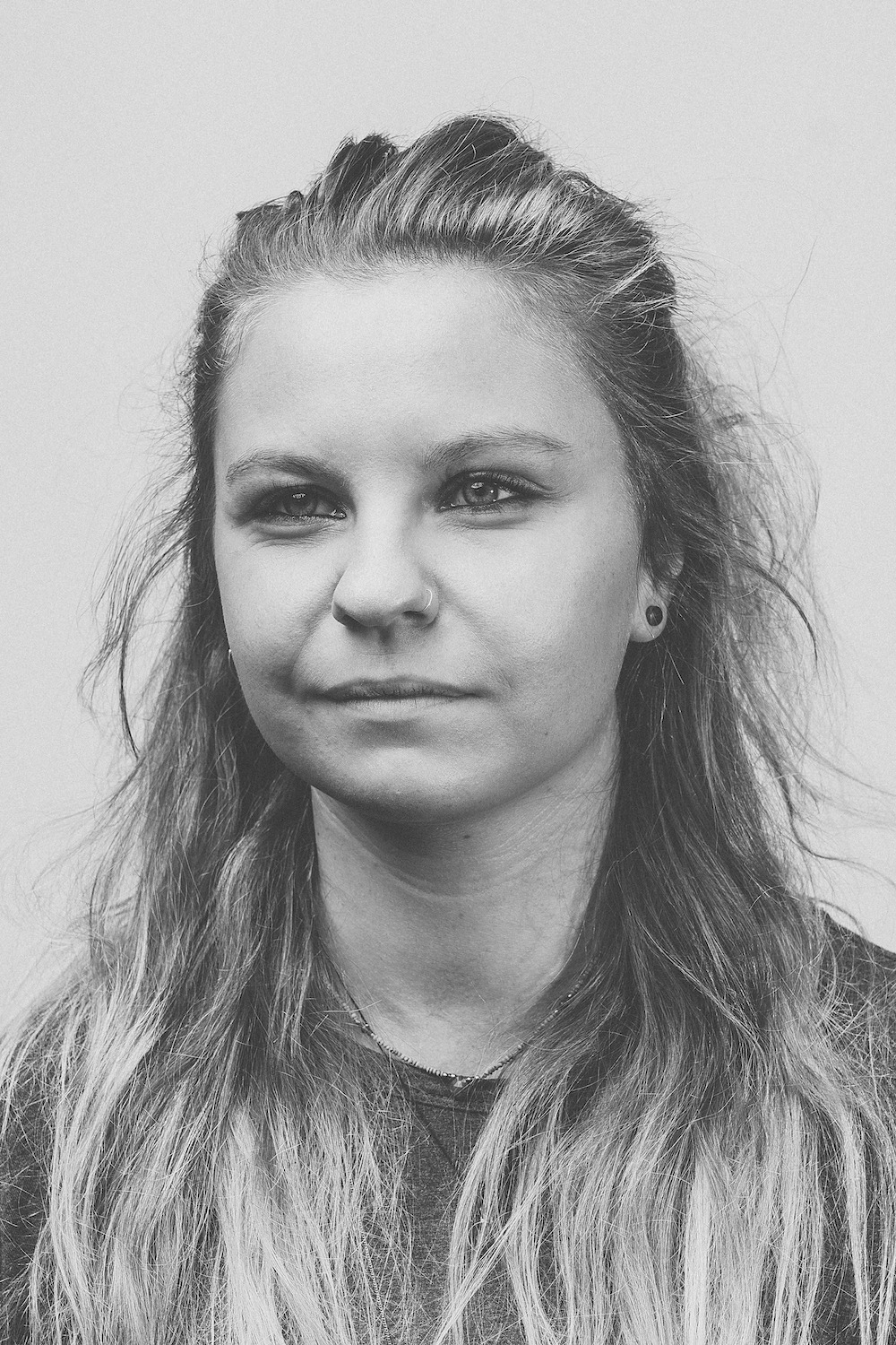 Allie, Senior Designer at Folch.
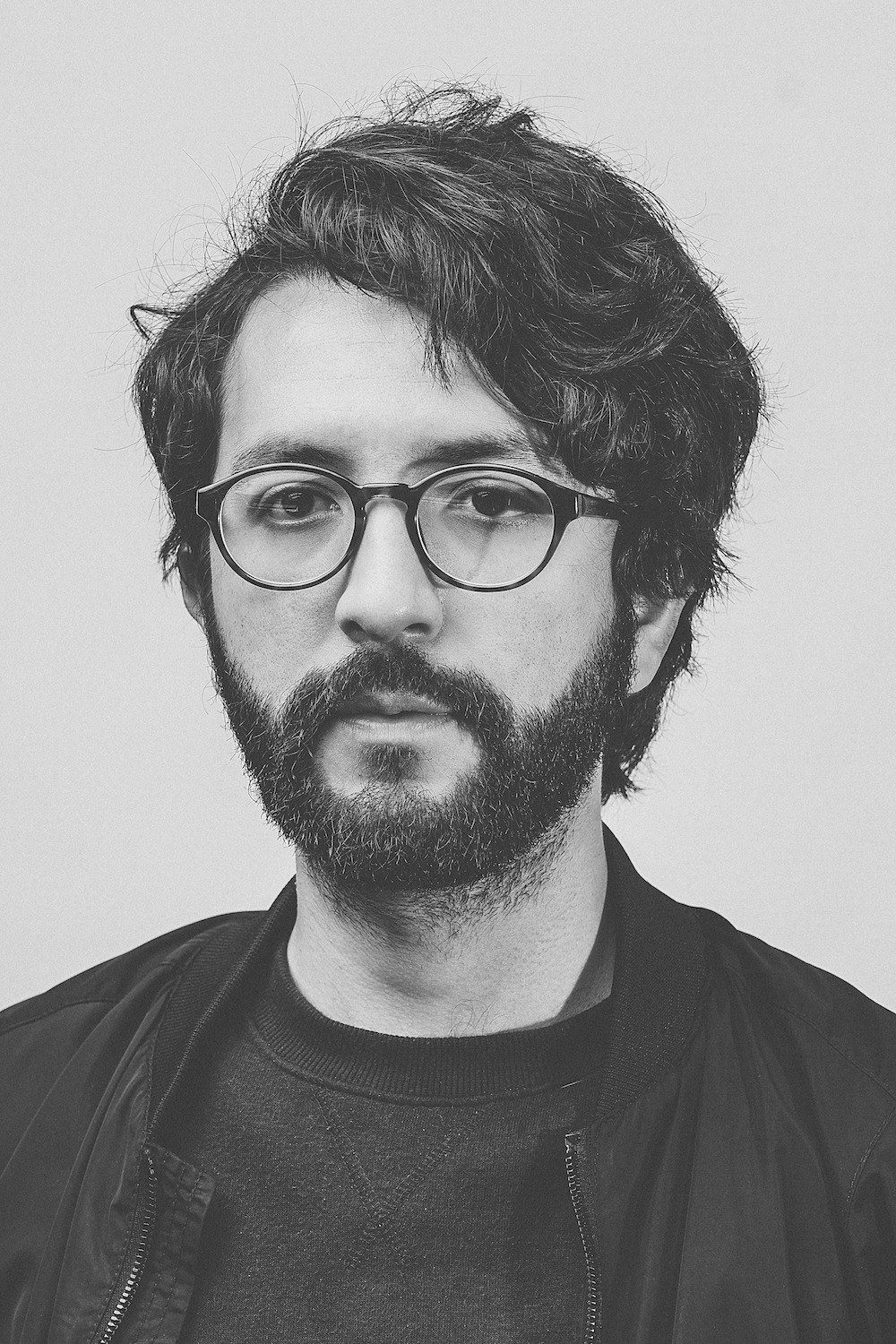 Camilo, Senior UX/UI Designer at Folch.
How do the different medias relate and interact?
In a digital age where boundaries between formats and media are not clear anymore, websites and social media have become key for a magazine to expand and fortify its reach and editorial approach. For Openhouse, the website aims to enrich the universe of the magazine, bringing the brand into an interactive environment where content can be adapted and alternated at a faster rate.
Which aspect of Openhouse’s new identity was the greatest challenge?
Taking the magazine in a new direction while maintaining its essence was essential. Having followed Openhouse’s trajectory for a long time, creating a whole new identity without losing the brand’s trademarks was definitely a challenge, but one we thoroughly enjoyed.
What would you highlight as the key change of the new Openhouse?
For us, the harmony that characterizes each section of the new Openhouse magazine is an essential part of the brand identity. Flexible layouts reflect the unique subject matter of each article, whilst at the same time maintaining rhythm and flow through a strong visual narrative and use of white space.
What is your favourite part of the magazine?
We really like the cover of the magazine and the way it functions as a window into what will happen inside. We put lots of effort into turning the cover into a reflection of “The Life We Share” premise.


