Aesop
Introducing our last studio project for Aesop
As a studio, Openhouse creates content moving away from traditional marketing models, dressing up the message with a curatorial approach and bringing the vision of the brand closer to their audience sensibility and interests.
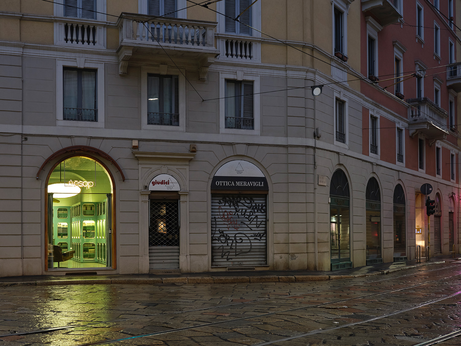
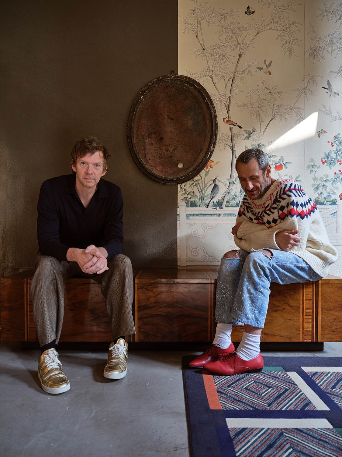
The aim of this commission was to learn about the meticulous and precise design work behind every Aesop store in the world. In order to achieve it, Openhouse studio chose the shop designed by Dimorestudio in Milan as a case to study. We met Britt Moran and Emiliano Salci in their gallery as we portraited their studio and the shop. Located in Milan, not far from Aesop store, the space that once was their home-studio became the scenario of an interview in which we got the opportunity of learning about their methodology, yearnings and goals. An enriching conversation that resulted in a film, photographs and a story for Aesop.
Aesop & Dimorestudio
NOTHING IS KNOWN, EVERYTHING IS IMAGINED
“Nothing is known, everything is imagined” is a quote from a well-known film by Federico Fellini. Poetry and fantasy do not intend to teach; they do not depend on full and complete knowledge, but flourish in settings where thought and vision are released without the need for proof, in order to elicit a response.
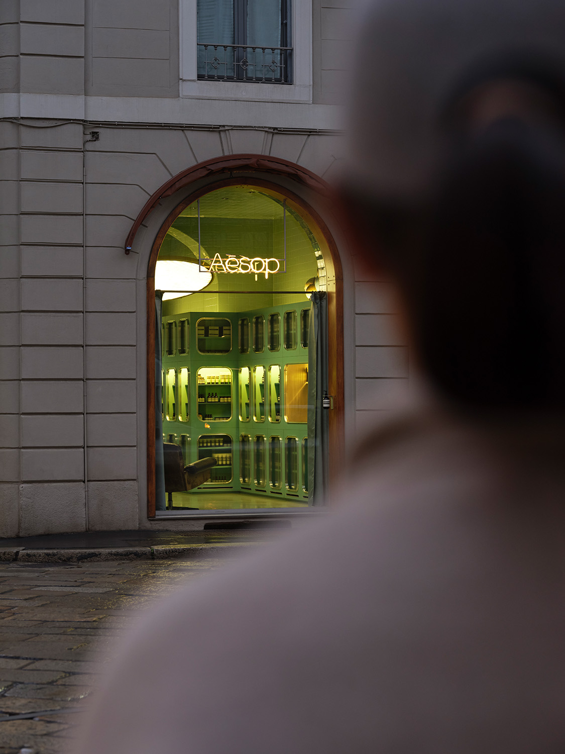
Likewise, the Dimorestudio universe is constructed as if it were an image taken from a dream. The skilfully orchestrated arrangements by Emiliano Salci and Britt Moran could easily be film sets suspended beyond time, conveying suggestions and visions on the edge of reality because, in fact, “nothing is known” but “everything is imagined”. “Our way of thinking is always as though we were looking through a lens, from behind a camera,” says Emiliano. “Whether it’s a shop, a house, a restaurant or any other place, I like the atmosphere, the slightly evocative part, as if I were inside a dream, in a film.”
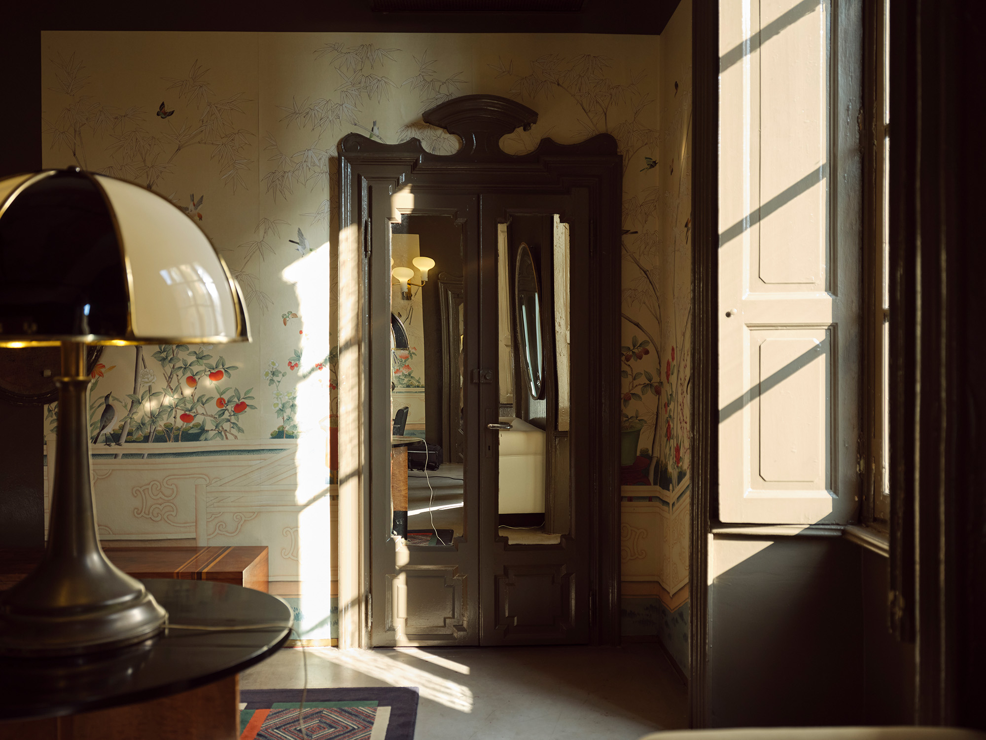
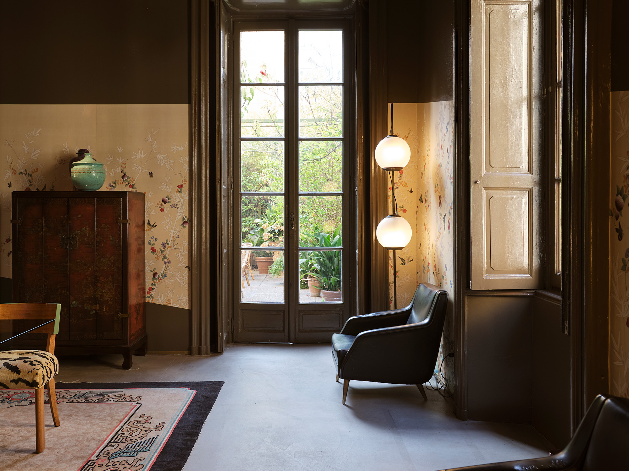
The construction of images in space is a particular feature of this duo’s approach. This becomes apparent, by way of example, in the six rooms of Dimoregallery, Britt and Emiliano’s gallery in Via Solferino, in the heart of Milan’s Brera district. Founded in 2014 on the second floor of a twentieth-century palazzo in what had for almost a decade been their private apartment and design studio, they later transformed it into a single exhibition space where design icons are skilfully combined with contemporary pieces, artworks and personal objects, all with great attention to detail.
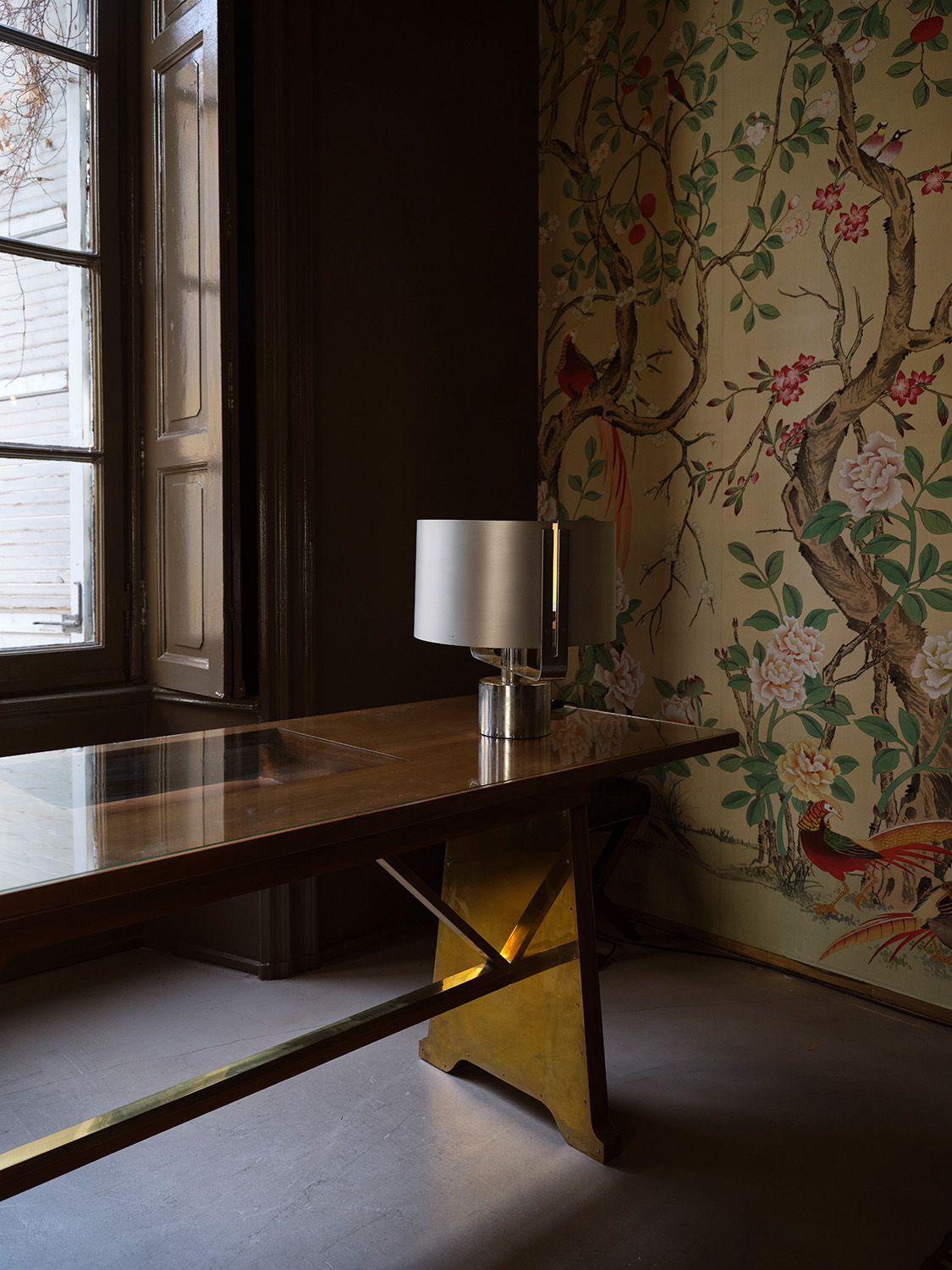
The impression of having once been an abode has been preserved in the current layout, in which one room follows another flanking a corridor that runs through the space. The feel of a refined residence is preserved by appealing to the five senses, and involving not only the part that is visible or open to touch but also the less palpable and more ephemeral aspects such as fragrance, which changes with each arrangement.
The special attention given to aesthetic pleasure, which enters through every channel of perception, immediately creates a direct dialogue with Aesop, the company whose store in Corso Magenta, one of two in Milan, was designed by Dimorestudio. “There was an immediate harmony, a sharing of a mutual language that allowed us not to distort our vision. For us, design is a 360-degree process, both for the gallery and all the spaces where we intervene, and combines the different ages and languages that have a common sense, a common thread,” says Emiliano.
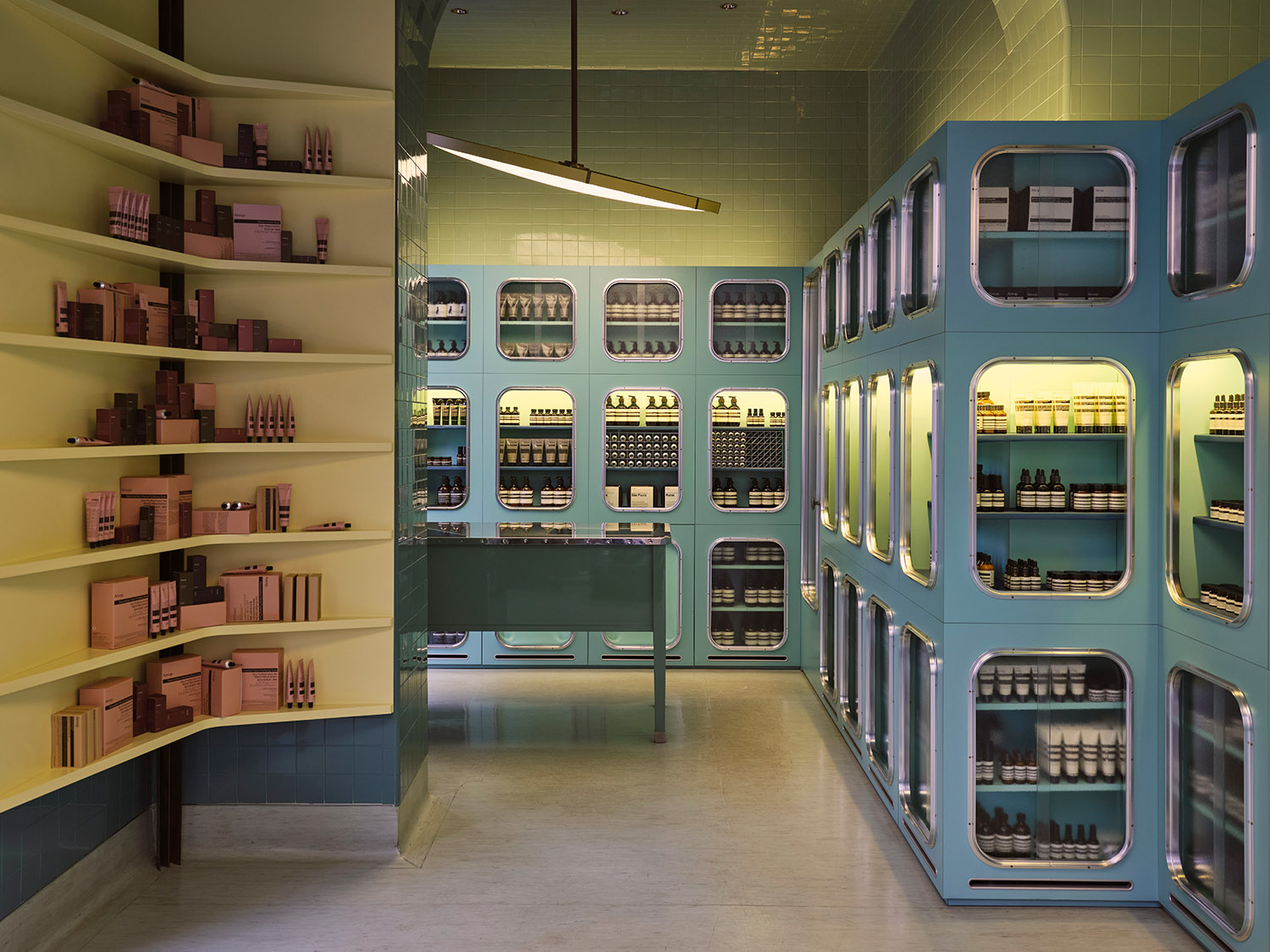
“What we were able to do with Aesop was to share aspects that are important to us on a cultural level,” adds Britt. “I remember, for instance, that the source of inspiration for the furniture was the butler’s pantry in Villa Necchi Campiglio…” It, therefore, comes as no coincidence that the floors of the Corso Magenta store are covered in linoleum, a material whose appearance has little refinement but was the height of modernity in the 1930s. Piero Portaluppi, architect of the Milanese villa, was among the first to use it, garnering heavy criticism.
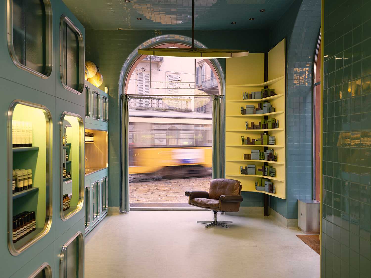
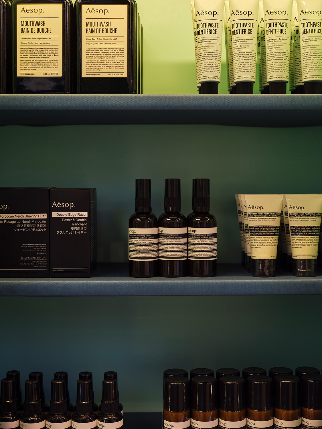
Not only the materials and the forms but also the colours of Villa Necchi Campiglio inspired the palette for the Aesop project, resulting in the different pastel tones that range from blue-green to pale pink and are the perfect expression of early twentieth century taste. From among the distinctive features of the space, Emiliano underlines the importance of “the large ceiling light set on a slight tilt and with a printed underside to create a quasi-clinical effect, and a window design that, despite the products, also conceals the sink and the more functional part”
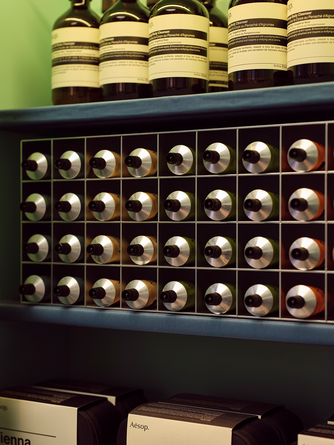
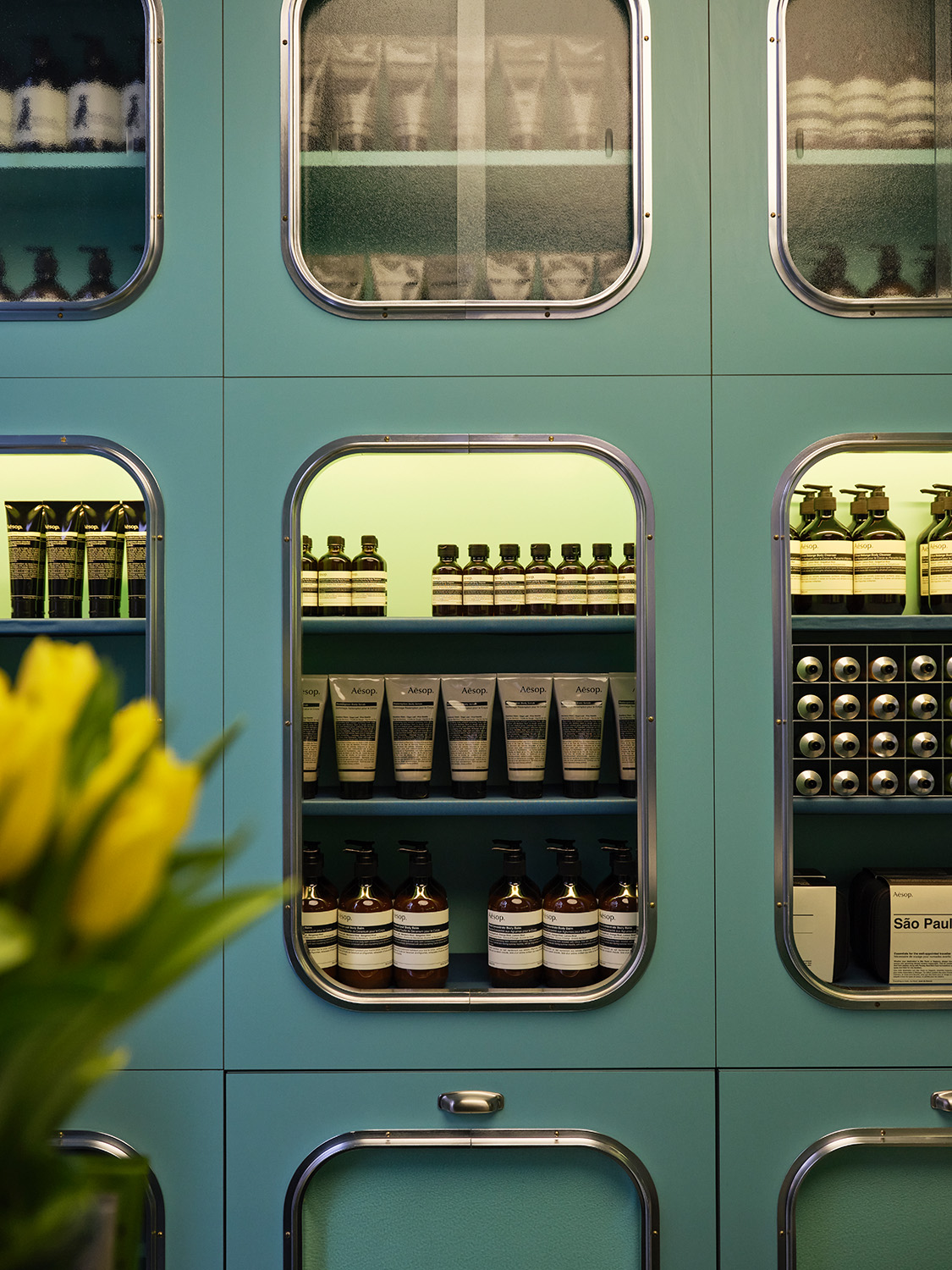
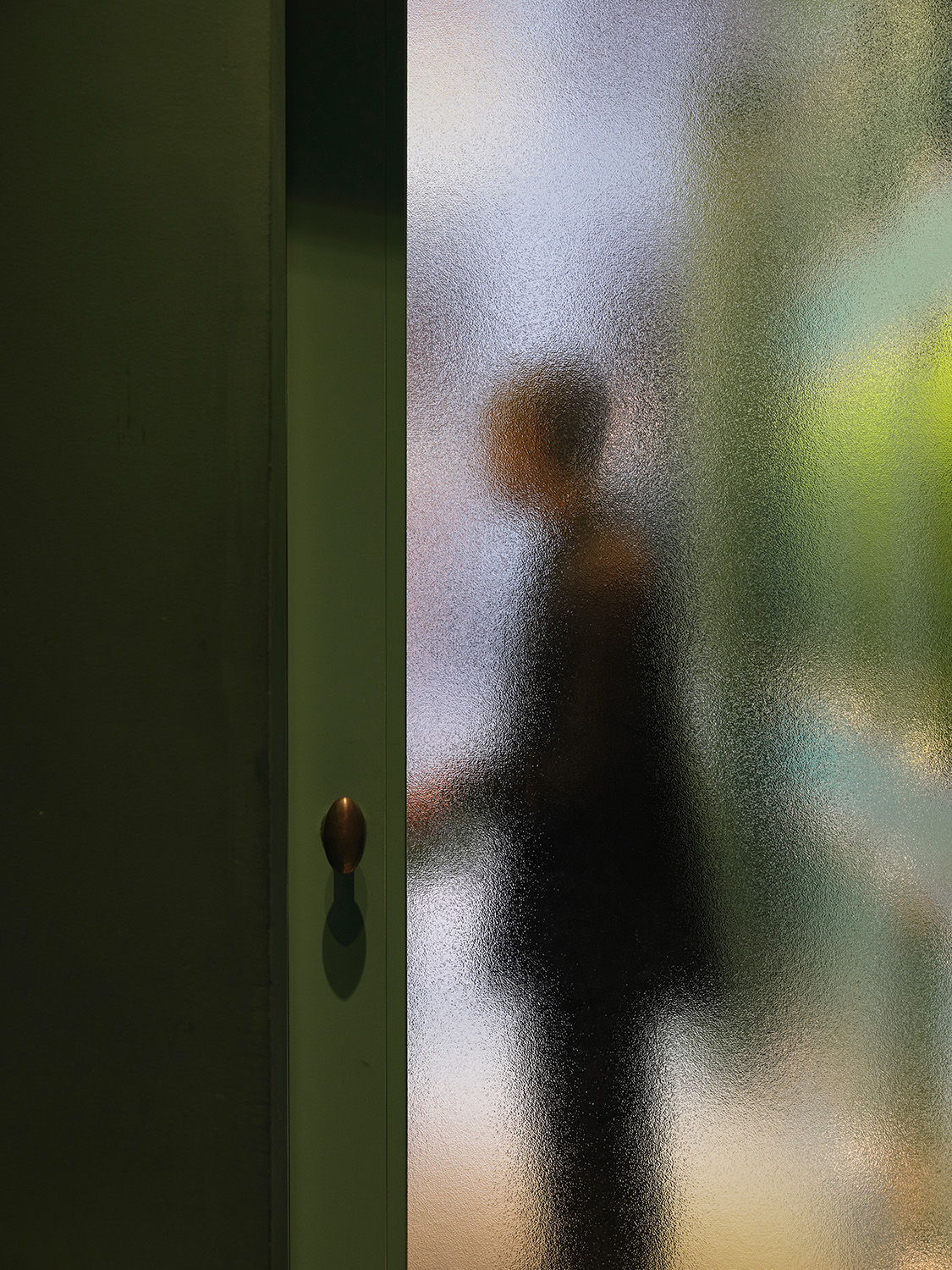
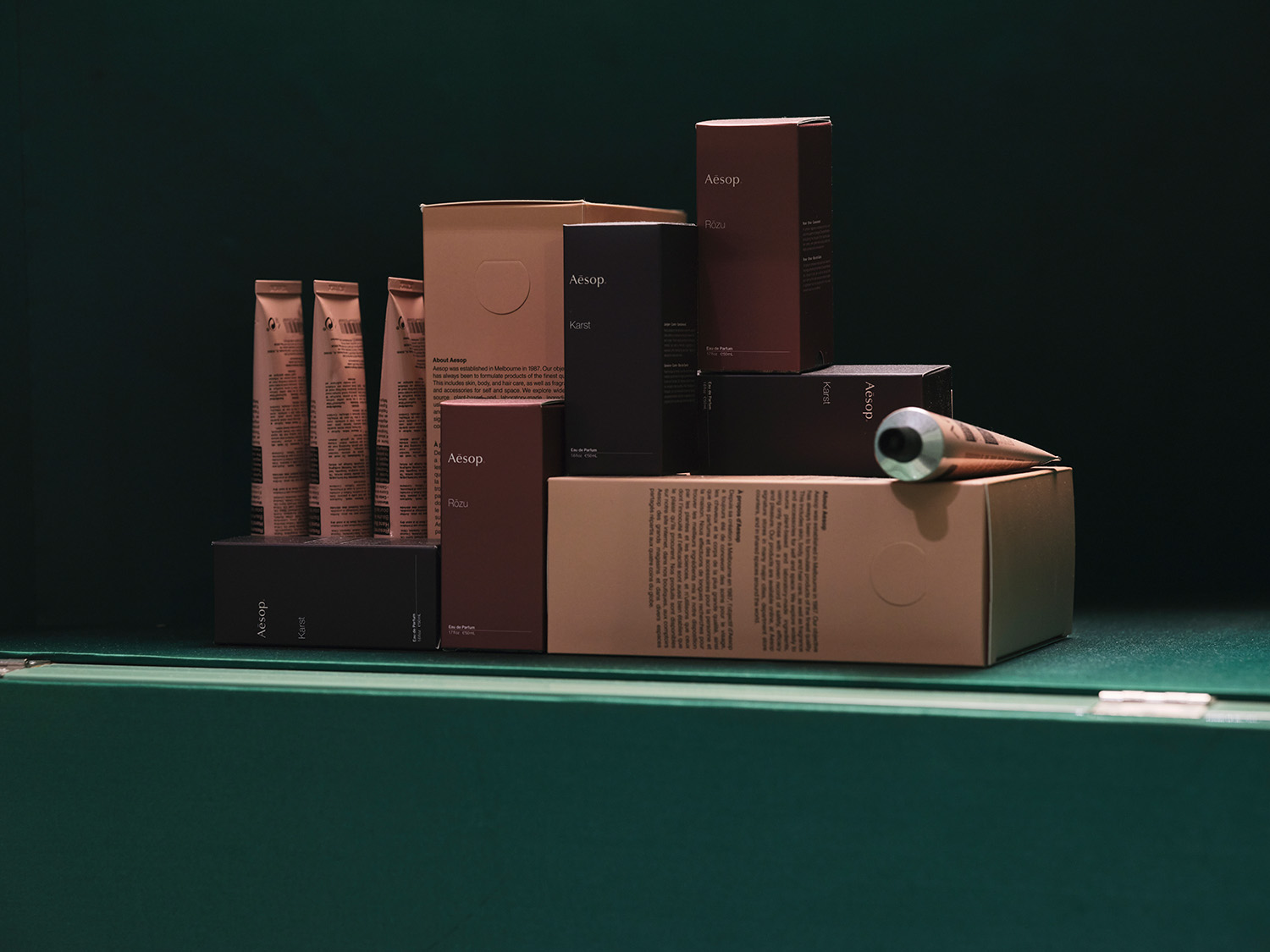
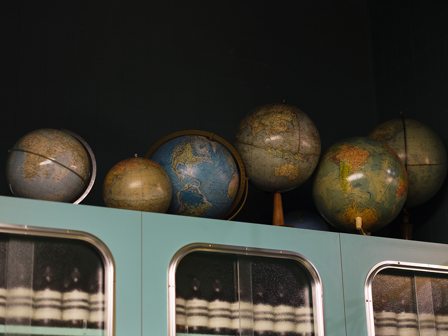
Among the various elements that characterise the project, there is no doubt about the significant weight that the Corso Magenta area, with all its history, had in the design. Integrating the project into an urban fabric dotted with historic shops, first and foremost of which is the famous Marchesi 1824 pastry shop, drove the duo’s inspiration and allowed them to succeed with both elegance and mystery. There is, in fact, a whole interplay of atmospheres that takes place inside this small neighbourhood shop which, like the stage of a theatre, or a film set, is revealed to Corso Magenta when the velvet curtains of a large window facing the street are drawn back. An intimate living room is then seen from the outside that, in turn, offers a glimpse of the world of body care through portholes – reminiscent of the round windows in the bathrooms of Portaluppi’s villa – displaying the neatly-ordered products.
Love of the twentieth century, of the history of, mainly but not exclusively Italian, design and architecture is an essential for Dimorestudio, which exemplifies knowledge and respect for the past in both the exhibition and research activities at the gallery and in the contemporary collections and custom-made projects. The present is undoubtedly a hotbed of invention and innovation but, in order to be significant today, you cannot neglect what has gone before, and you must be aware that, as Emiliano hastens to add, “there’s no need to do much more; sometimes it’s enough to simply use what already exists because the contemporary ended for certain things a long time ago, and many designers were in fact much more avant-garde in the past than they are today”.
Curiosity and investigation are the driving forces behind the work of the new generations, for whom knowledge of history will be increasingly important if they are to face future challenges with assurance. The city of Milan, in this sense, is an open book on twentieth century Italy to become engrossed in, with its streets to be discovered with eyes turned upwards. From the aforementioned Villa Necchi Campiglio to the Albergo Diurno Metropolitano spa, also by Piero Portaluppi, to Giò Ponti’s Pirelli Tower, to the Torre Velasca by BBPR… In fact, as Britt says, “Milan isn’t as ugly as so many people say; it’s a city to be discovered.”
